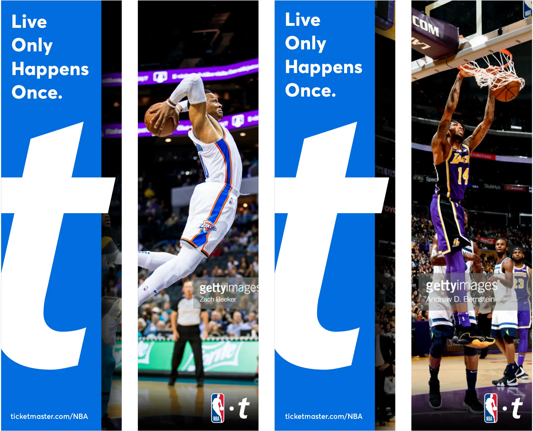
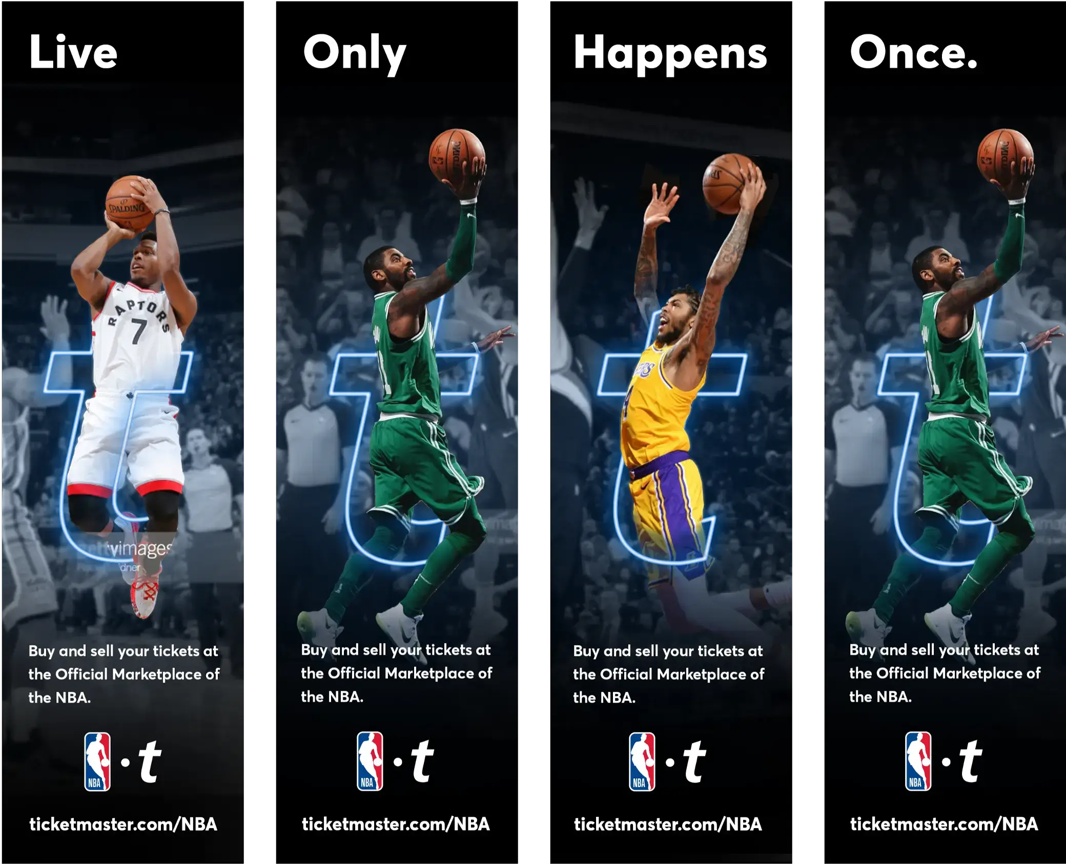
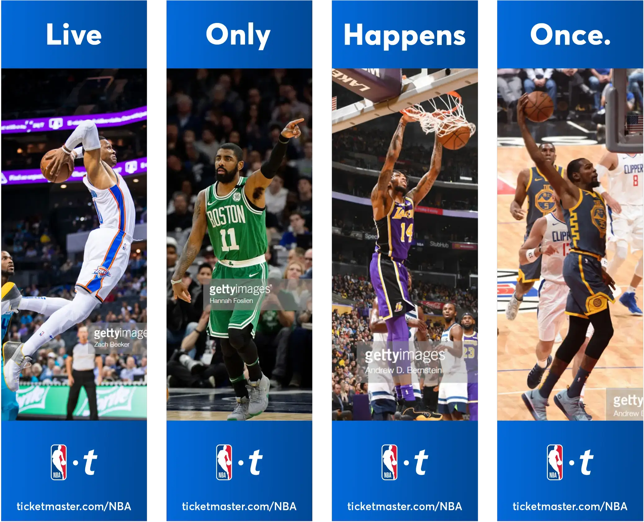
Live Only
Happens Once

CLIENT //

Ticketmaster

TIME //

1.5 Years

PLATFORMS //

Web, Digital, Social, Print

ASSIGNMENT //
Ticketmaster needed a scalable content system to fuel digital and social campaigns across 400,000+ events annually. Dynamic ad templates had to flex across pro teams, live entertainment acts, and brand partners. Messaging aligned with ‘Live Only Happens Once,’ driving engagement, conversions, and consistency. Assets spanned paid social, display, and email—balancing the demands of leagues, teams, venues, and partners while delivering high-impact creative at scale.
DELIVERABLES //
Scalable content systems, dynamic ad templates, paid social campaigns, display ads, email marketing assets, brand-aligned messaging framework, flagship store takeover print ads, brand website frontend design.
TOOLS //
Sketch, Indesign, Photoshop, Illustrator, After Effects
PARTNERS //
Contend, Liam Labs, NFL, NBA, NHL, MLS, NCAA, Fanatics, US Open, Live Nation 

The Results

209%

Higher click-through rate (CTR), driving increased traffic to event pages.

26%

Boost in engagement, increasing shares and interactions across social platforms.

9.4x

Increase in conversion rates, streamlining customer journeys across event categories.

24%

Rise in sales, boosting repeat attendance and fan loyalty.

18%

Increase in overall event attendance, proving campaign effectiveness.

59K+

Creative assets produced, spanning major leagues, teams, and live events.


Establishing a Framework

Set Brand Pillars

The Foundation of Live //
Ticketmaster stands as the bridge between fans and unforgettable experiences. Every event is a fleeting, once-in-a-lifetime opportunity, and this truth anchors Ticketmaster’s core. From this foundation, the brand pillars were defined—solidifying its role as the gateway to the emotional and transformative power of live moments. These pillars became the blueprint for the manifesto, guiding every design, message, and execution
 
  1.  The Power of Live 
  2.  Seamless Access
  3.  Trust & Transparency
  4.  Innovation in Experience
  5.  Fans First

Build for Scaling

Flexible. Cohesive. Scalable. //
Ensuring creative consistency across diverse leagues and entertainment partners required a system that could flex without breaking. We developed a modular framework that empowered customization while maintaining brand integrity. Automation, dynamic asset generation, and streamlined workflows became the foundation for agile execution—allowing campaigns to adapt in real time without compromising quality. This approach ensured every event retained its unique identity while still fitting within a cohesive, scalable ecosystem.

Build for Impact

Designing for Emotion //
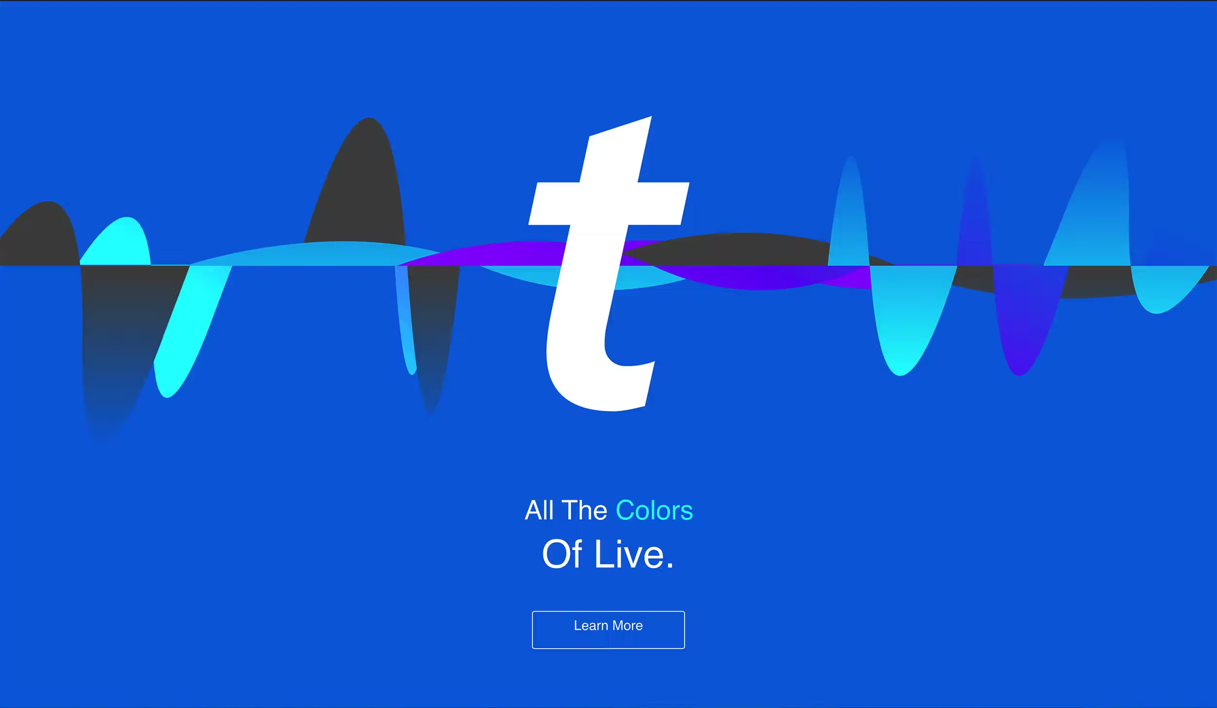
Building a creative system for Ticketmaster wasn’t just about design—it was about ensuring every promotion reflected the pulse of live experiences. Each asset needed to channel the energy of a live event while staying true to brand identity. We focused on crafting content that didn’t just promote an event but conveyed its atmosphere—capturing the excitement, anticipation, and emotion that define live entertainment.
By aligning design, motion, and messaging with the unpredictable nature of live moments, we established a foundation where campaigns resonated deeply with fans and inspired engagement.

Frame a Manifesto

The Power of Now //
"You know it when it happens—that rush of adrenaline when your heart and mind align. That moment when you realize you’re exactly where you’re meant to be, experiencing something that will never happen again. Nothing else in the world compares to that feeling.
 
It’s called being alive.
 
When time stands still, and moments turn into magical, unforgettable experiences...."

Define a Brand Line

The LOHO tagline became a guiding force, influencing every fan interaction and creative decision. It reinforced Ticketmaster’s role as the crucial link between anticipation and experience, making every event feel unforgettable the moment it begins.

LOHO_LINE

The Design System

Activates the Brand

Bringing the System to Life //
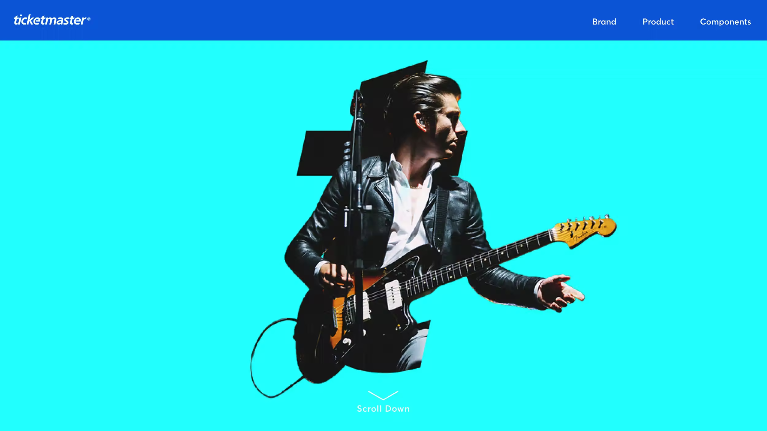
A brand isn’t just something you see—it’s something you experience. The challenge was taking Ticketmaster’s new identity and turning it into a seamless, scalable system that touched every fan interaction. Instead of just applying new visuals, we built an experience that moves, reacts, and resonates.

From a ticket confirmation pulsing with anticipation to digital content mirroring the energy of a packed arena, every detail was designed to make the brand more than recognizable—it had to be unmistakable.
tm_hero_brandguide_img_01

Distinguishes a Wordmark

More Than a Mark //
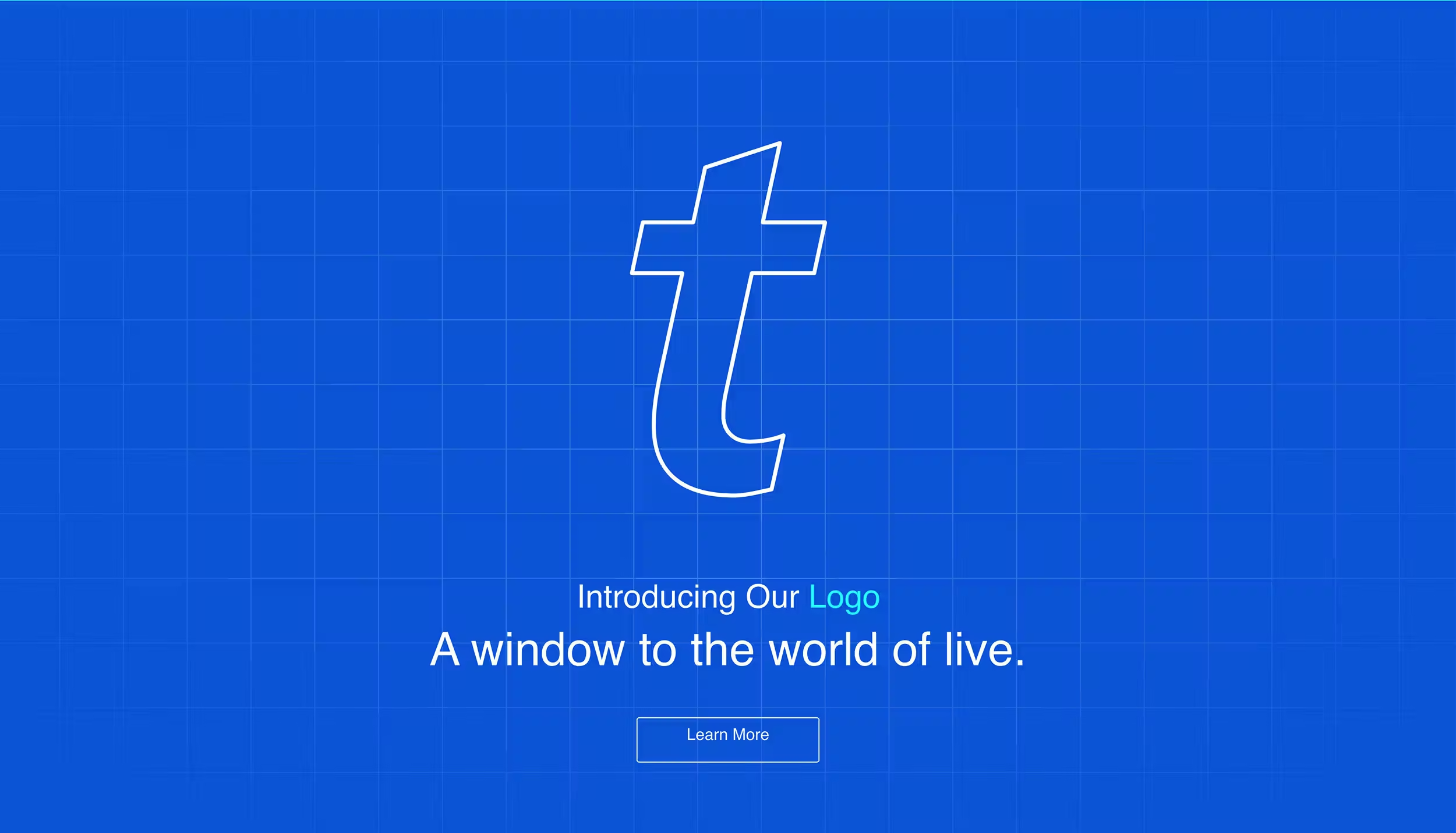
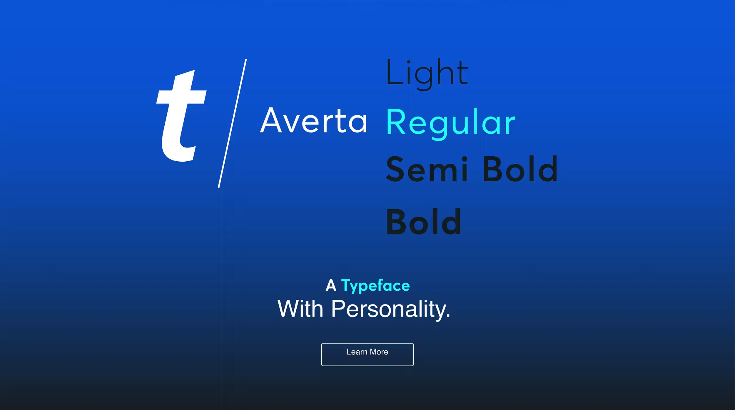
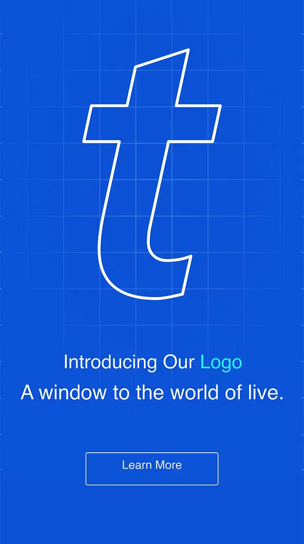
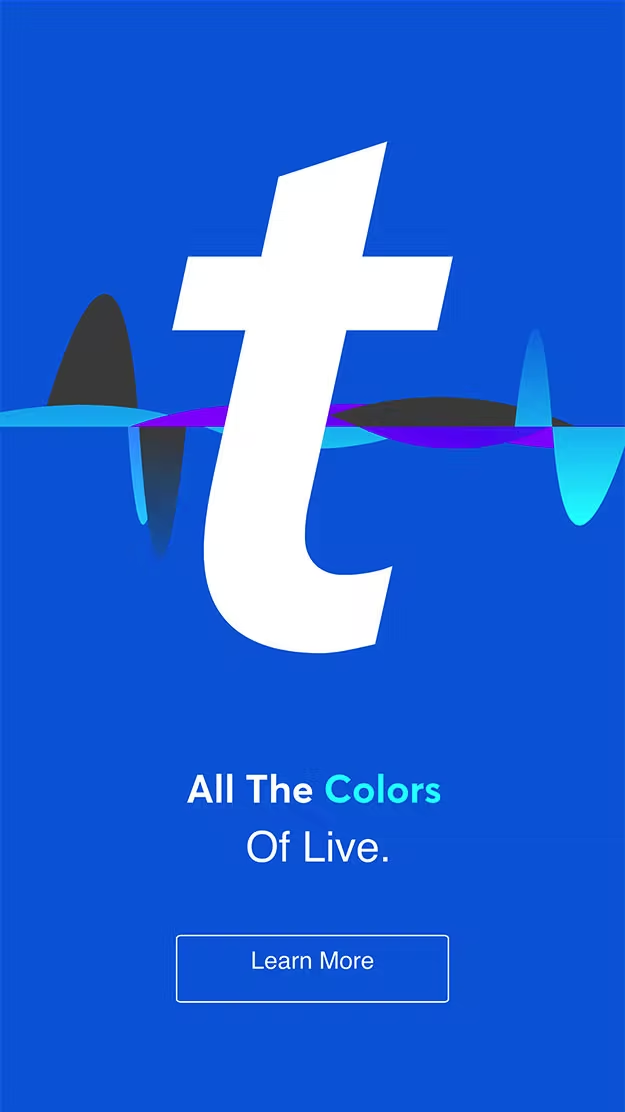
A design system starts with recognition—a mark that instantly connects with audiences. The "t" isn’t just a letter—it’s a cornerstone of Ticketmaster’s identity. It acts as a visual anchor, a framing device, and a recognizable stamp across every touchpoint. Whether in motion or static, the "t" was designed to be fluid, iconic, and scalable, ensuring it could live across diverse applications while maintaining its power.

Harmonizes Identities

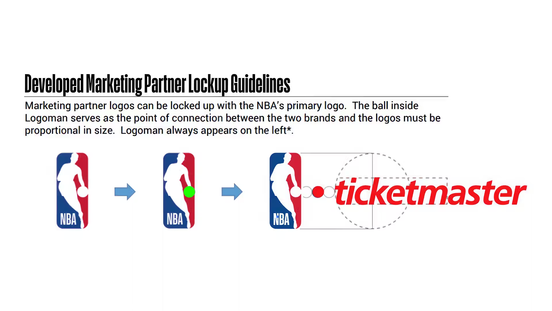
Unifying 100+ PartnerS //
Each of Ticketmaster’s partners had its own creative standards, requiring a design system that could flex without losing its identity. Instead of enforcing rigid rules, we established shared principles and adaptable frameworks that ensured Ticketmaster branding harmonized rather than conflicted. Whether for global sports leagues, artists, or venues, our system provided a unified foundation that respected individual brand expressions while reinforcing Ticketmaster’s unmistakable presence.
tm_hero_nbapartner_img_01

Anticipates Growth

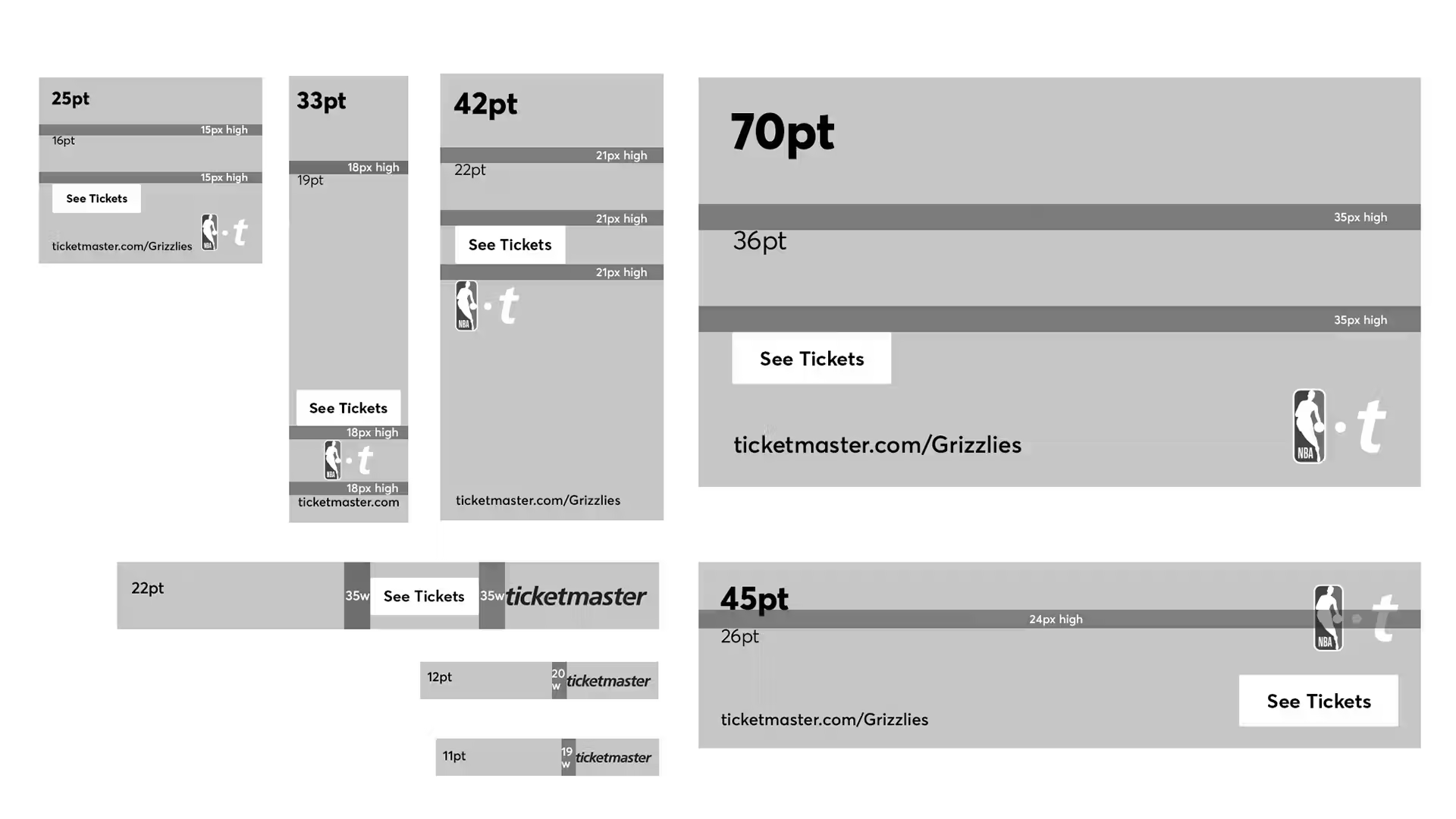
Modular and Adaptable //
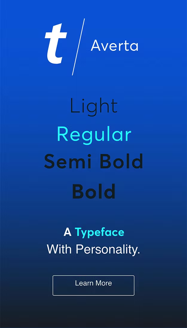
A design system must be as dynamic as the content it serves. We built a modular structure that ensures consistency without restricting creativity. Every element—typography, grids, motion behaviors, and layout principles—was designed to scale effortlessly across formats while maintaining clarity. Whether it’s a high-impact campaign or a last-minute promotional asset, the system allows for quick adaptation without breaking brand integrity.
tm_temp_design_system

Energizes With Movement

Bringing Stills to Life //
A design system must be as dynamic as the content it serves. We built a modular structure that ensures consistency without restricting creativity. Every element—typography, grids, motion behaviors, and layout principles—was designed to scale effortlessly across formats while maintaining clarity. Whether it’s a high-impact campaign or a last-minute promotional asset, the system allows for quick adaptation without breaking brand integrity.

Creates A Consistency

Guiding Visual Direction //
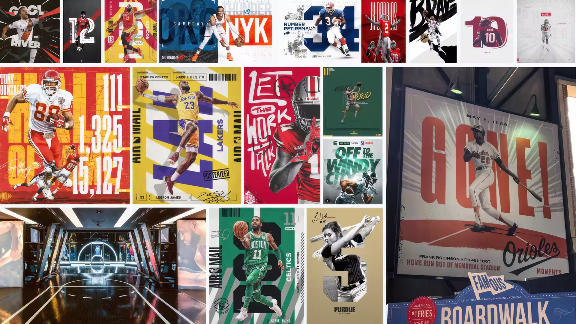
To create a cohesive system, we analyzed design approaches across various markets, identifying what resonated and what needed refinement. This research informed a structured yet flexible framework that housed our creative direction—ensuring Ticketmaster’s identity was not only consistent but also adaptable. By balancing partner needs with our vision, we developed a system that guided and elevated every visual expression, reinforcing a unified yet dynamic brand presence.
tm_hero_moodboard_01

The Work

01

NHL Flagship
 Fall Takeover

ASSIGNMENT //
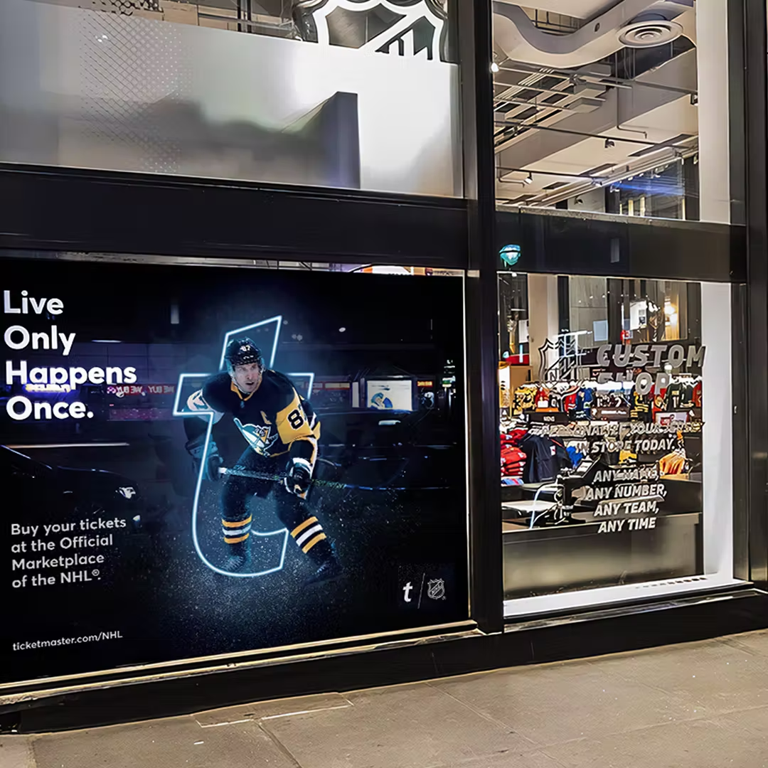
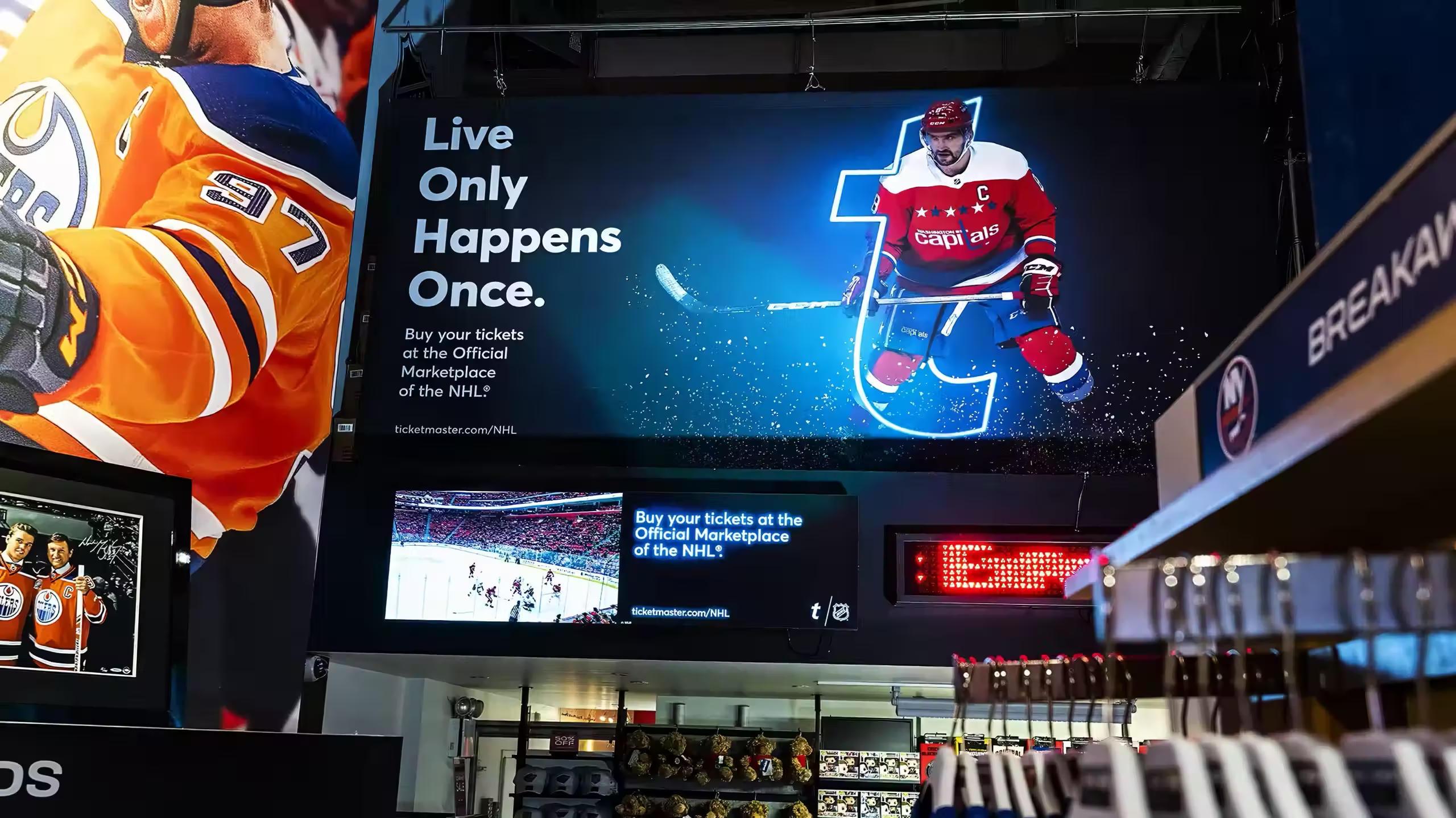
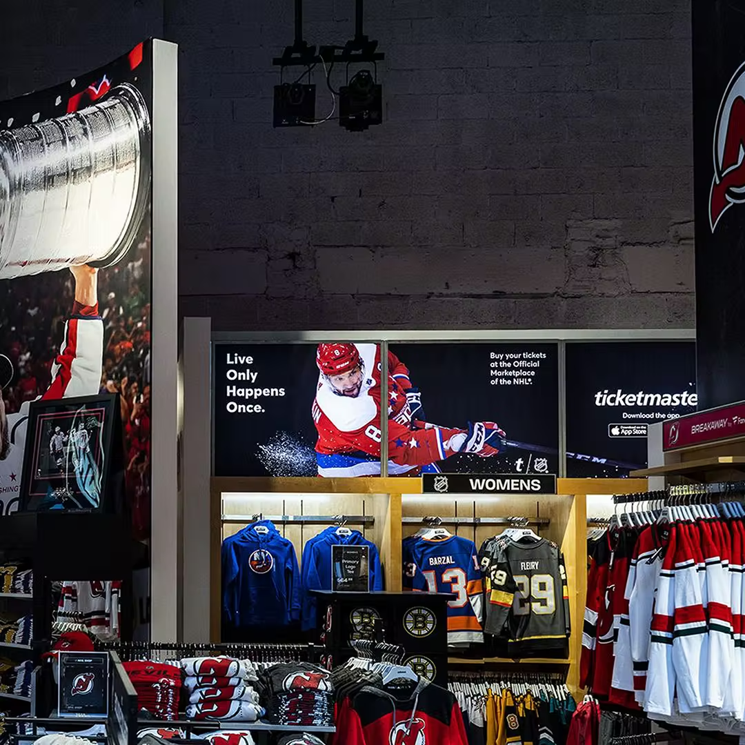
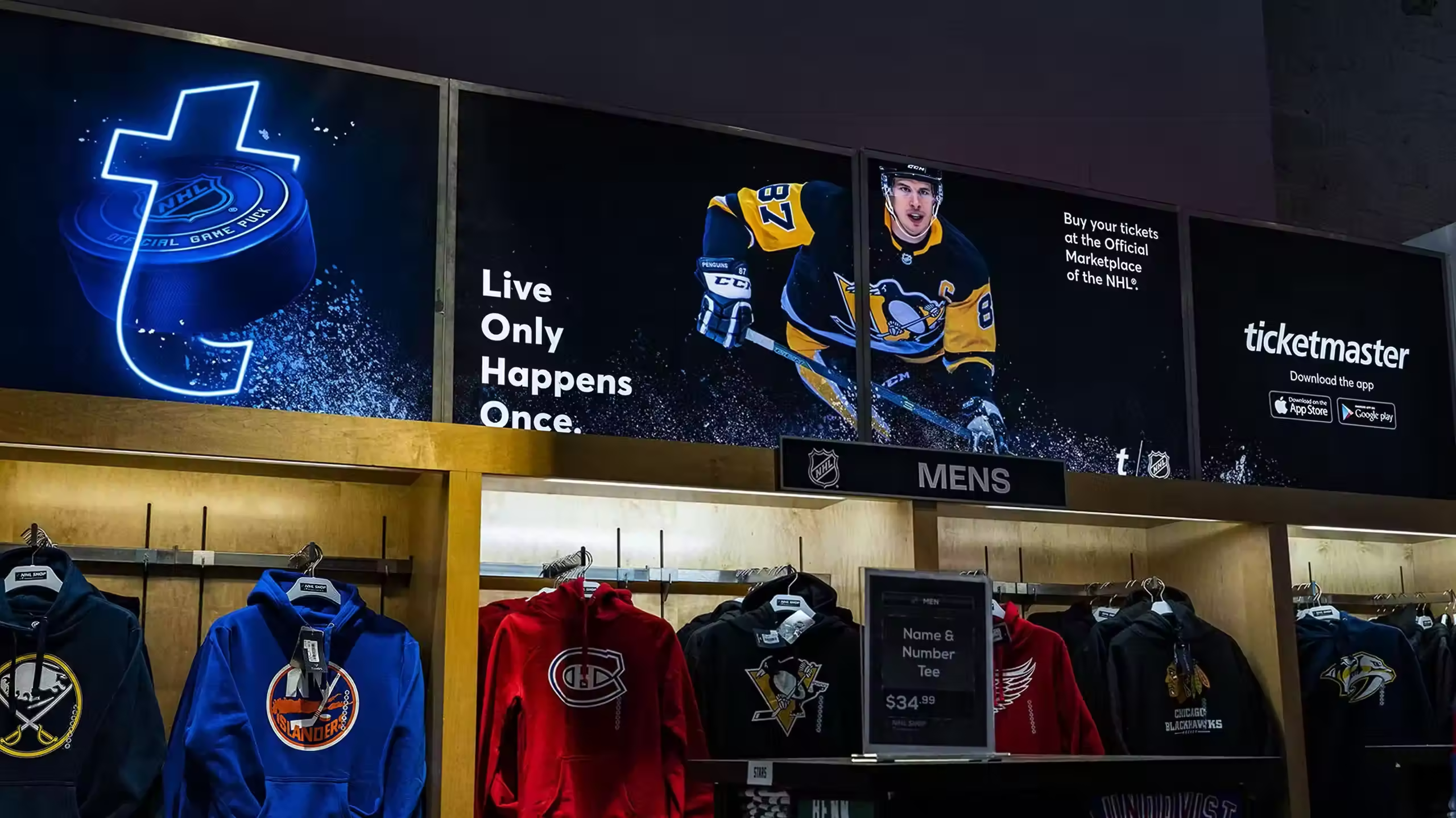
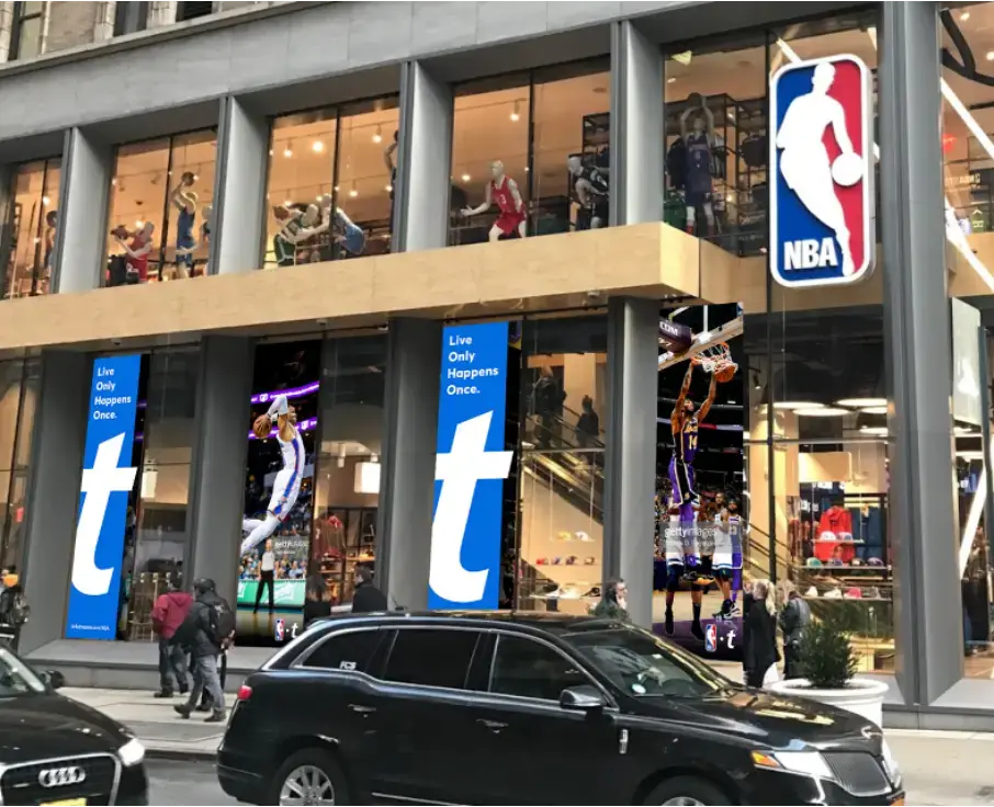
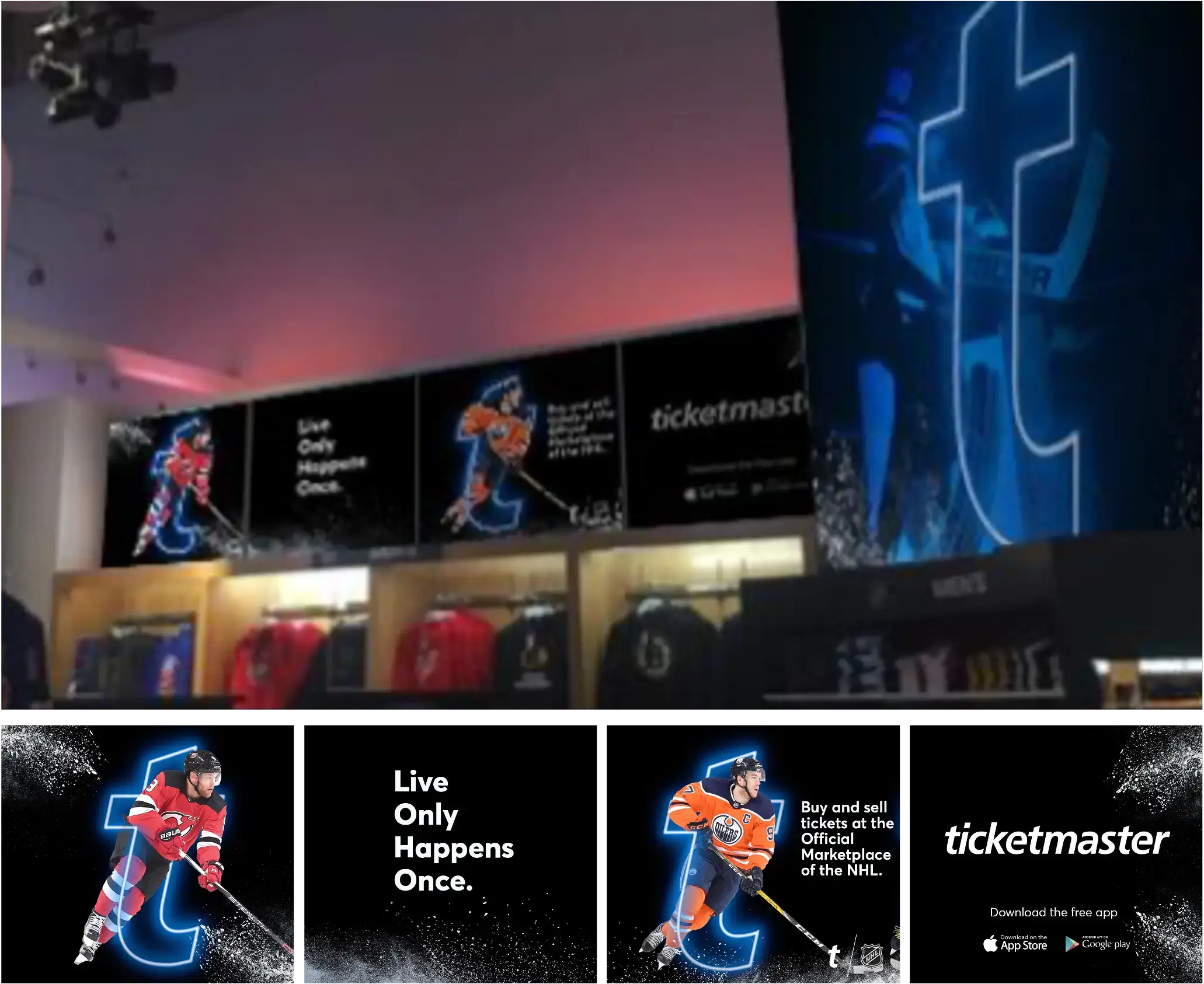
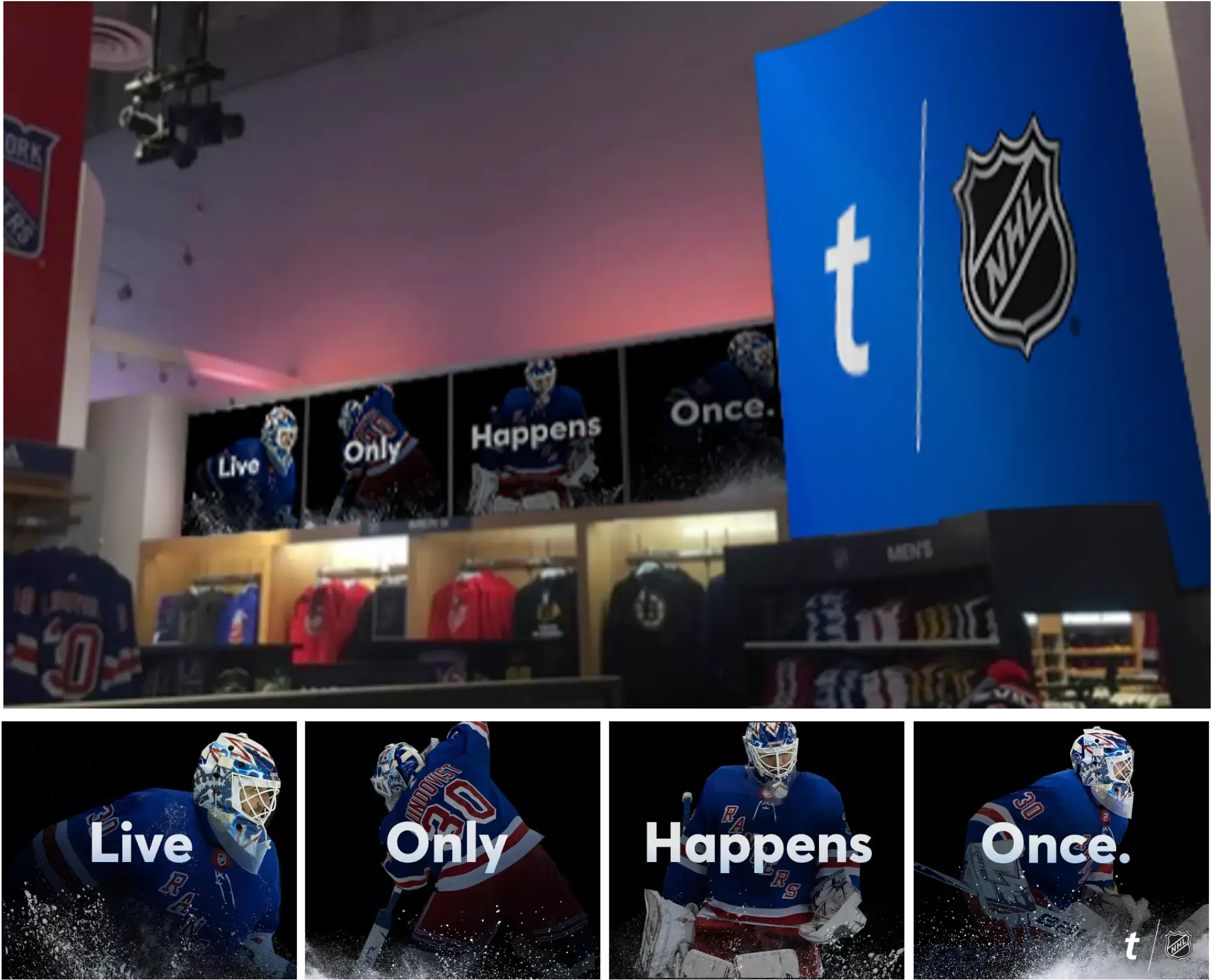
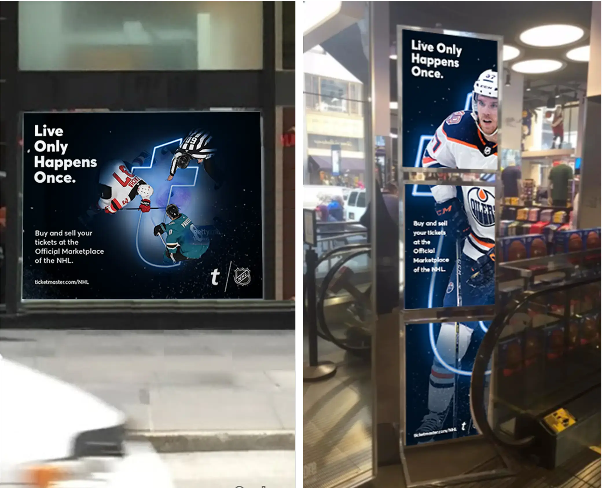
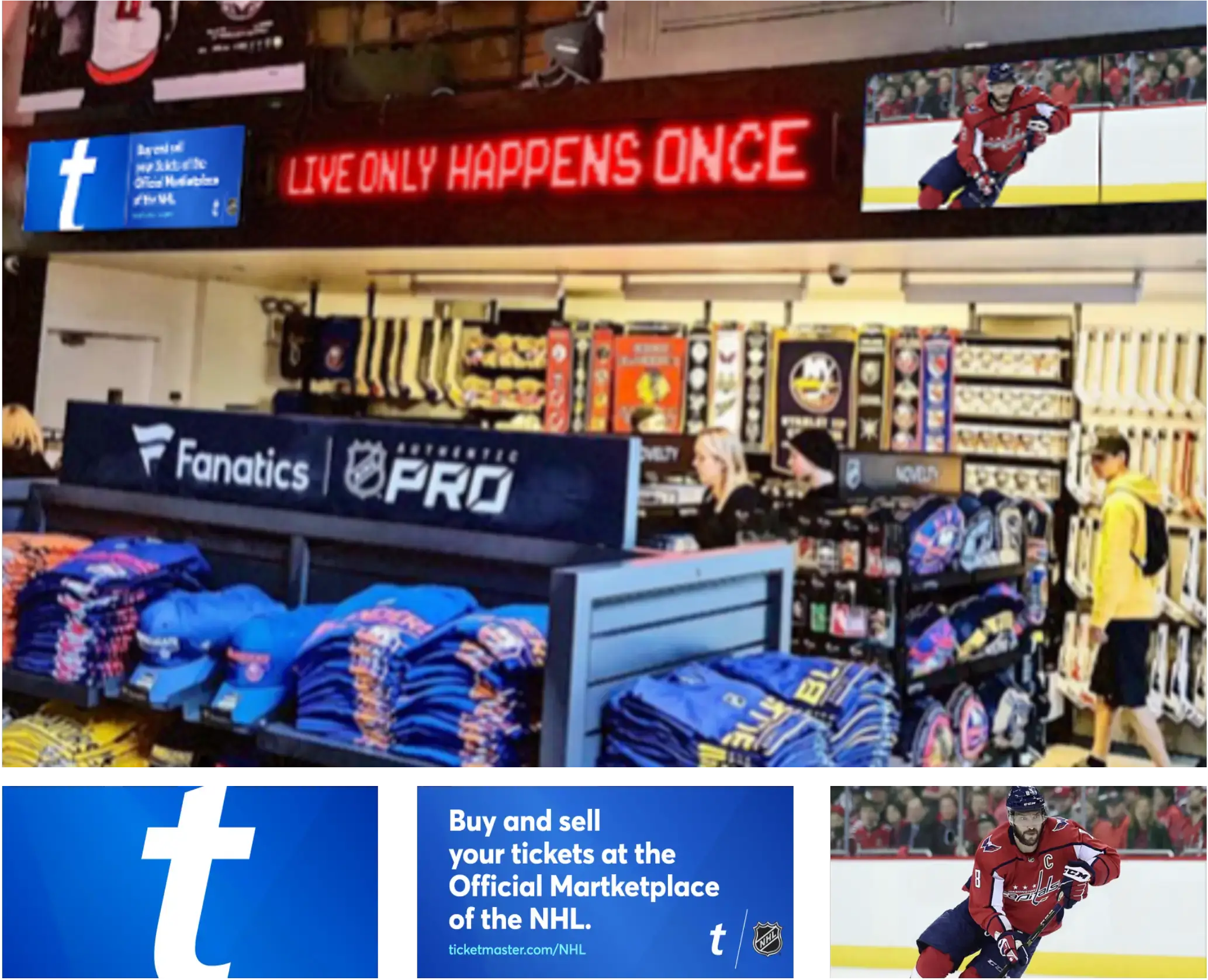
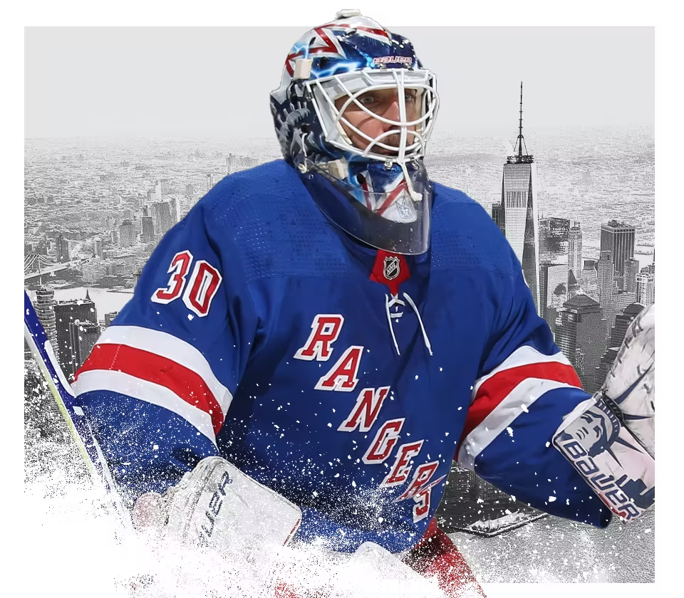
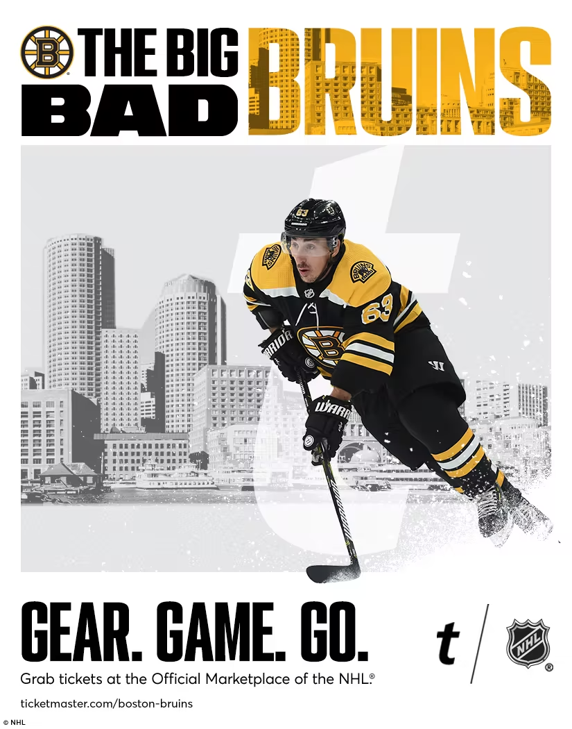
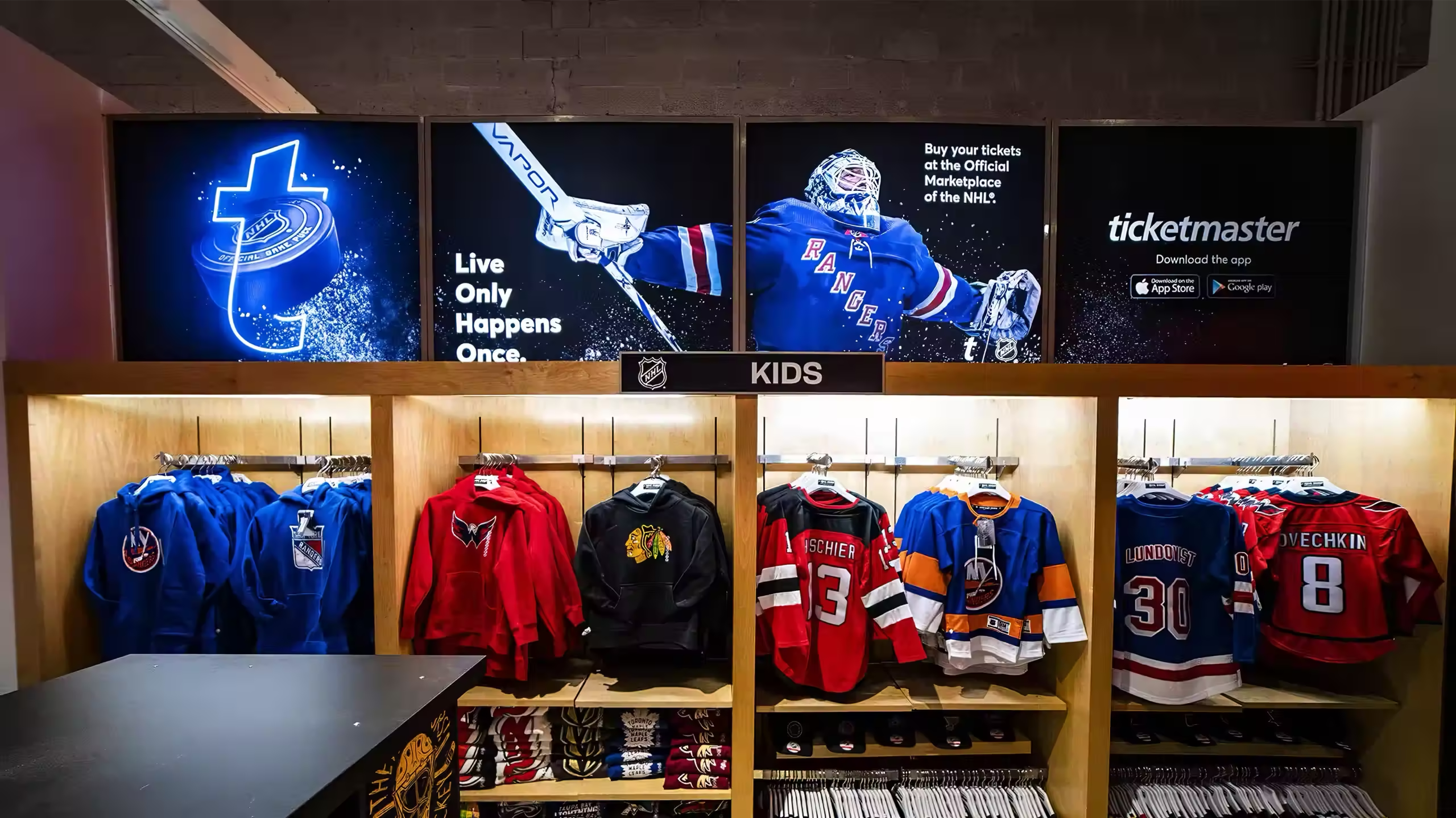
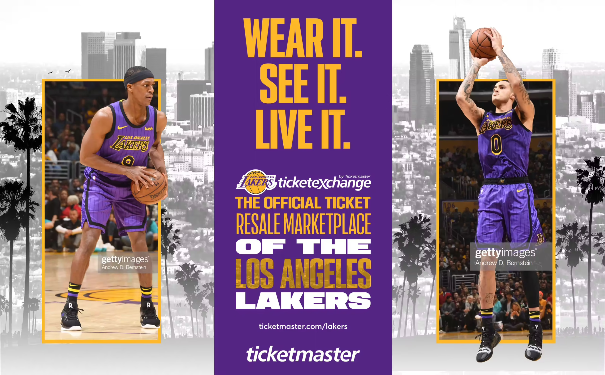
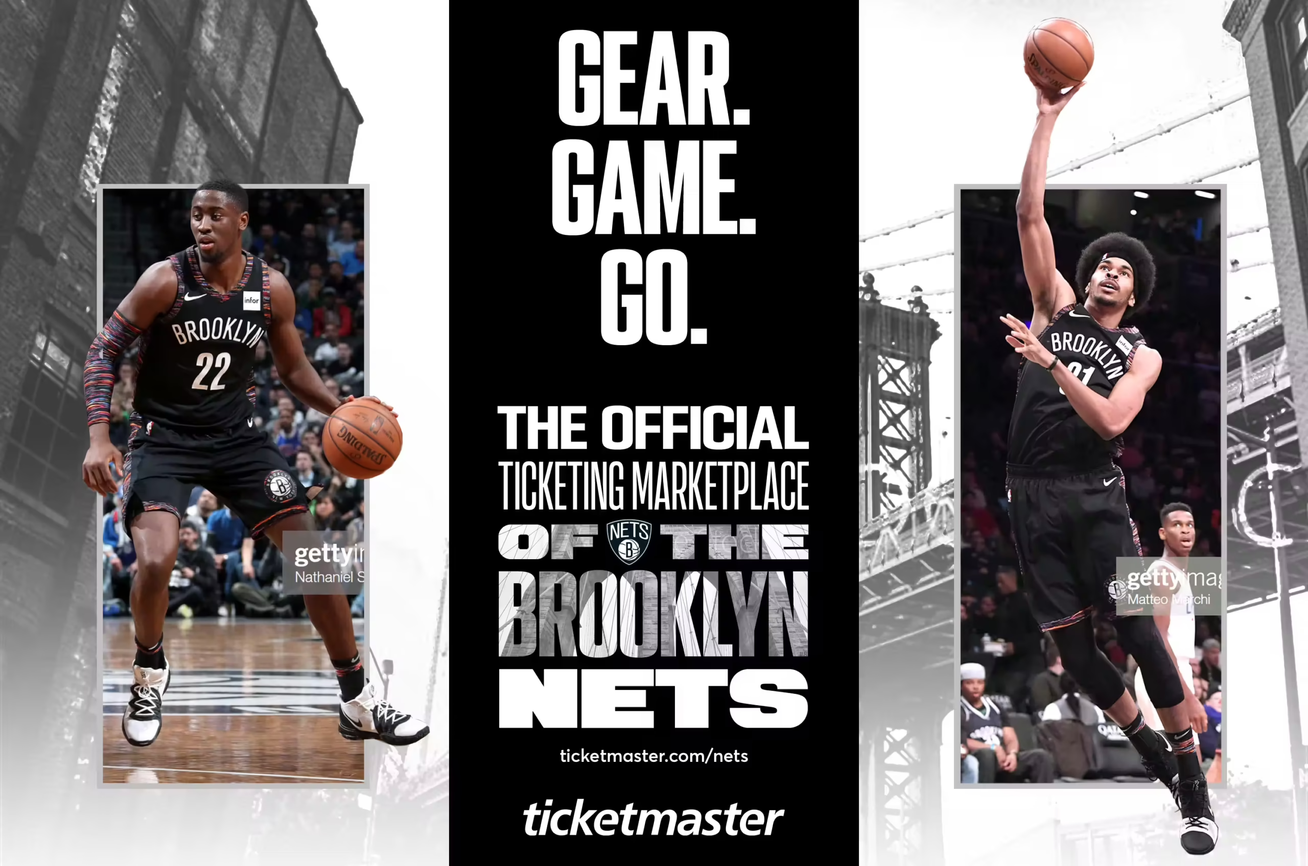
The NHL Fanatics store wasn’t just a retail space—it was an extension of the game-day experience. Ticketmaster aimed to extend its presence beyond the digital space and into high-traffic retail environments. The store was identified as a prime location to integrate branding that resonated with fans at the heart of the action. The challenge was to create an engaging, cohesive visual theme that connected Ticketmaster’s identity to the energy of live sports while maintaining consistency across different leagues.
DELIVERABLES //
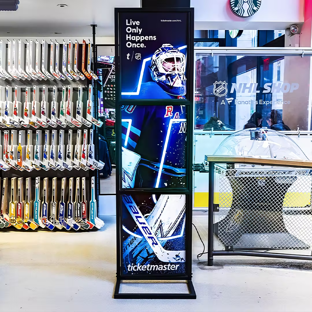
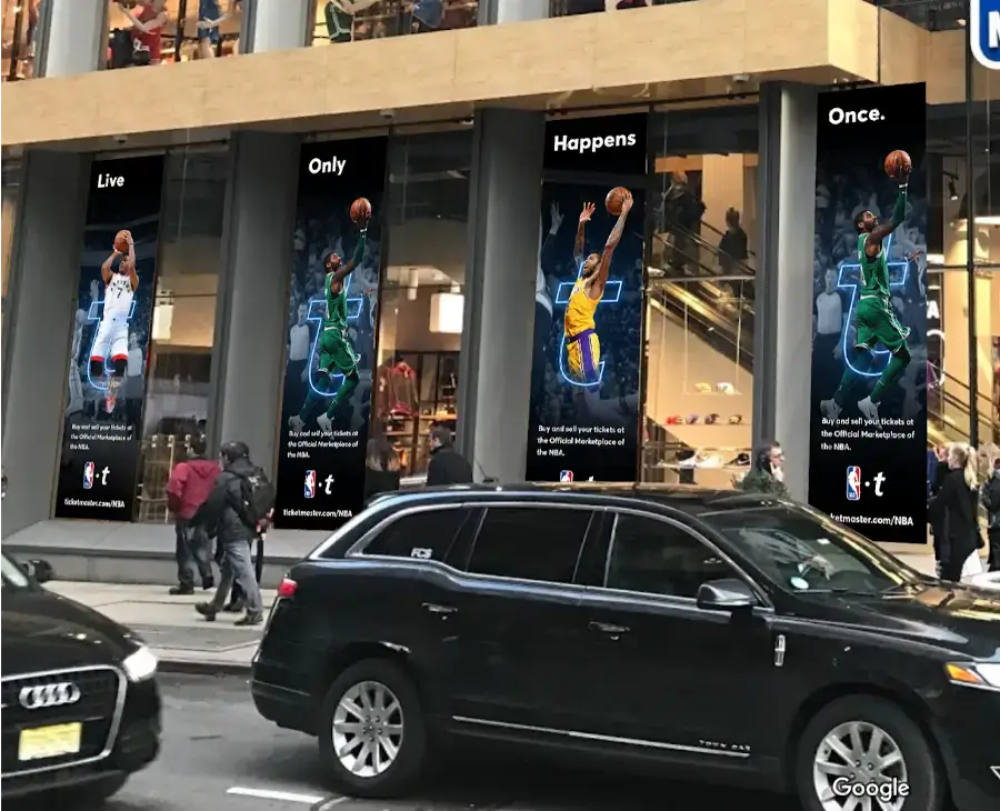
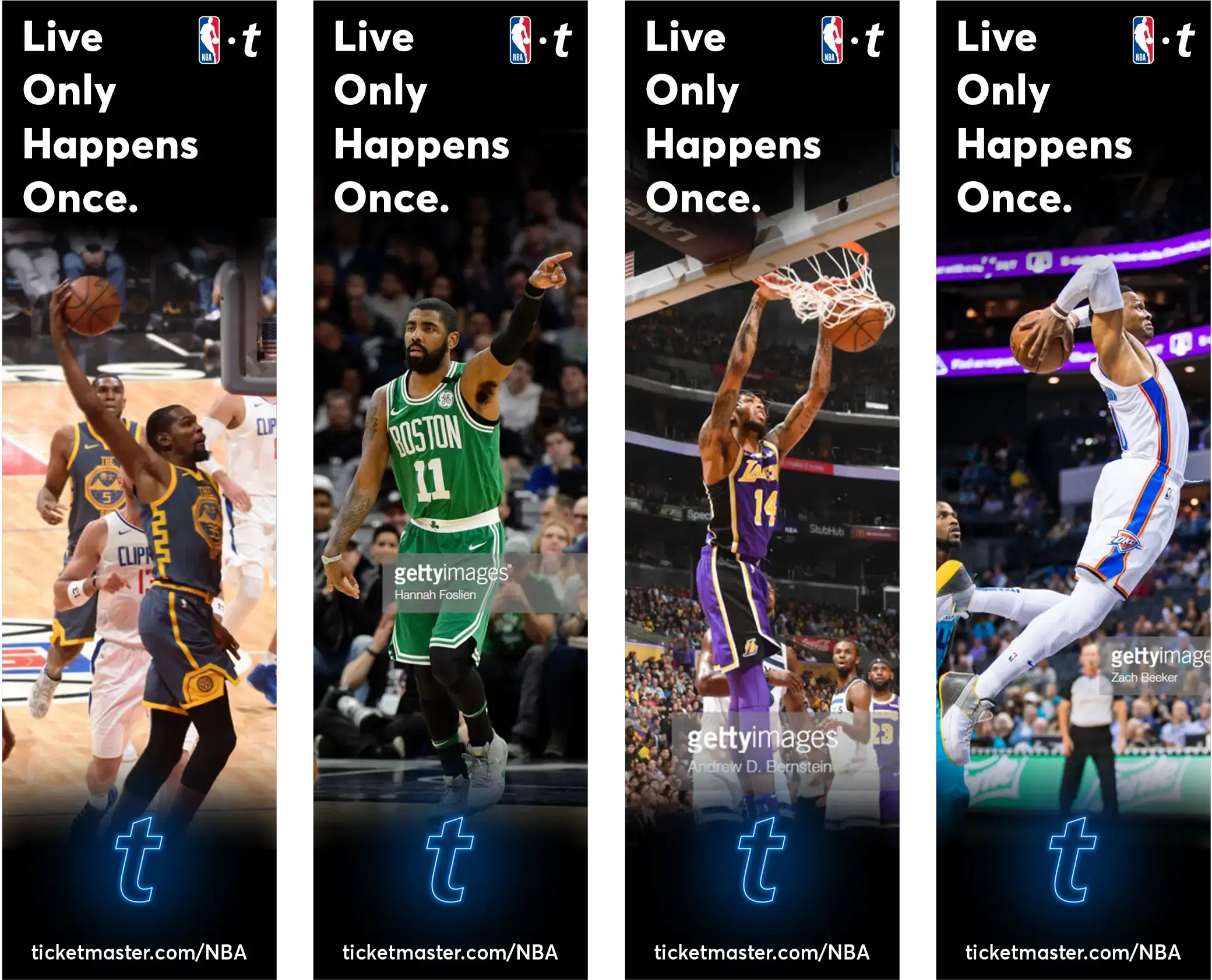
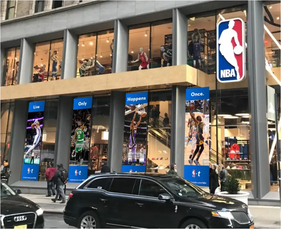
Large-format in-store signage and branding, digital and print promotional assets, window takeovers, point-of-sale visuals, league-consistent visual theme across NHL and NBA flagships.
Process //
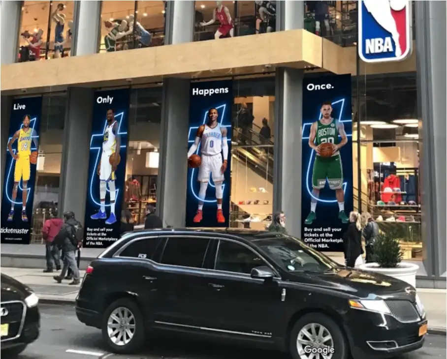
The process began with planning sessions to establish an overarching visual theme that bridged both the NHL and NBA flagship experiences. Collaborating closely with Angel Alfaro, who focused on the NBA’s flagship, ensured the branding maintained cohesion across leagues. Key steps included developing digital and print assets, conducting iterative reviews to align with stakeholder guidelines, and executing strategies seamlessly across all touchpoints.
Role //
Creative direction, brand identity alignment, stakeholder collaboration, placement refinement, messaging critique, and final execution.

Visual Explorations

Visualizing Fan Passion //
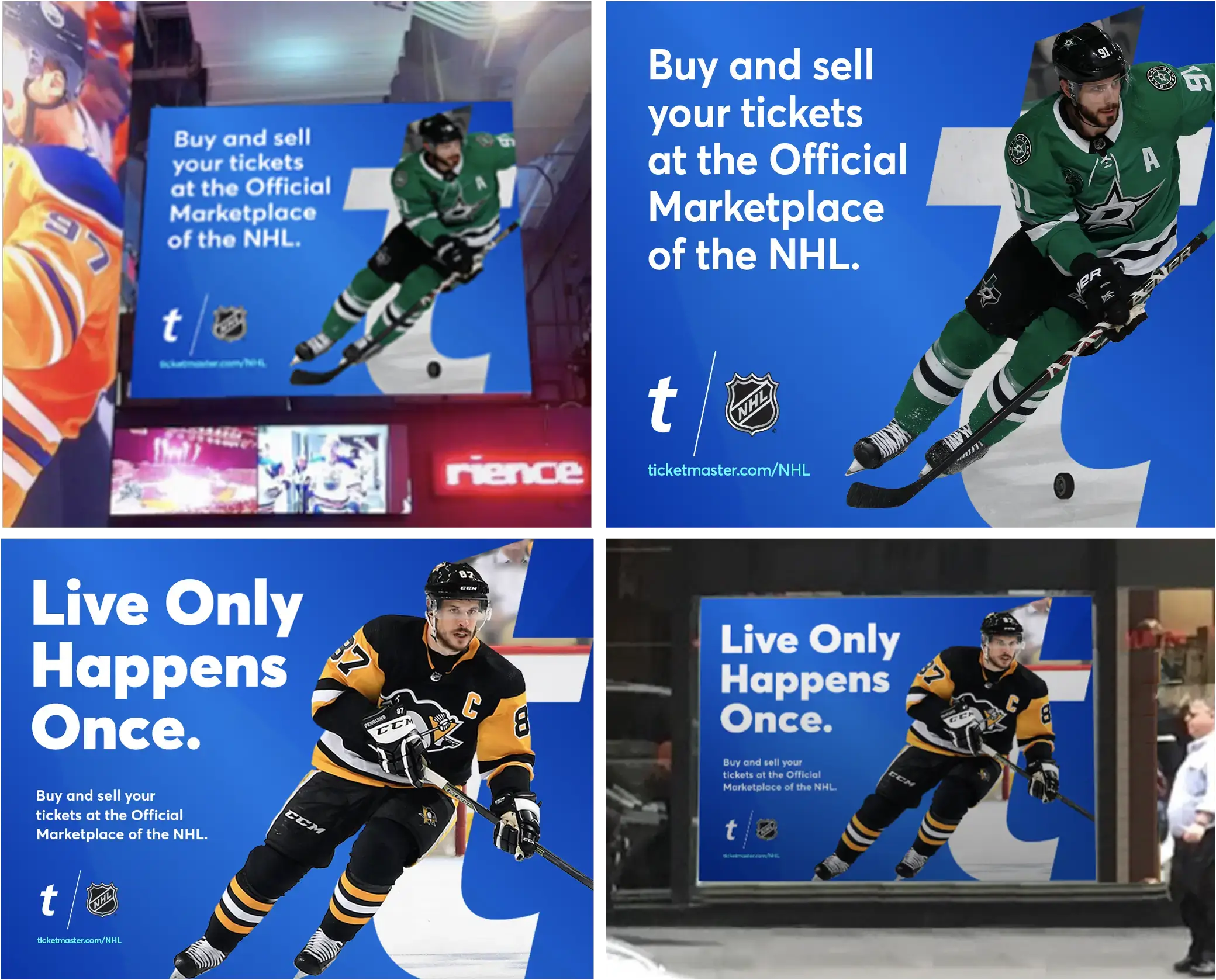
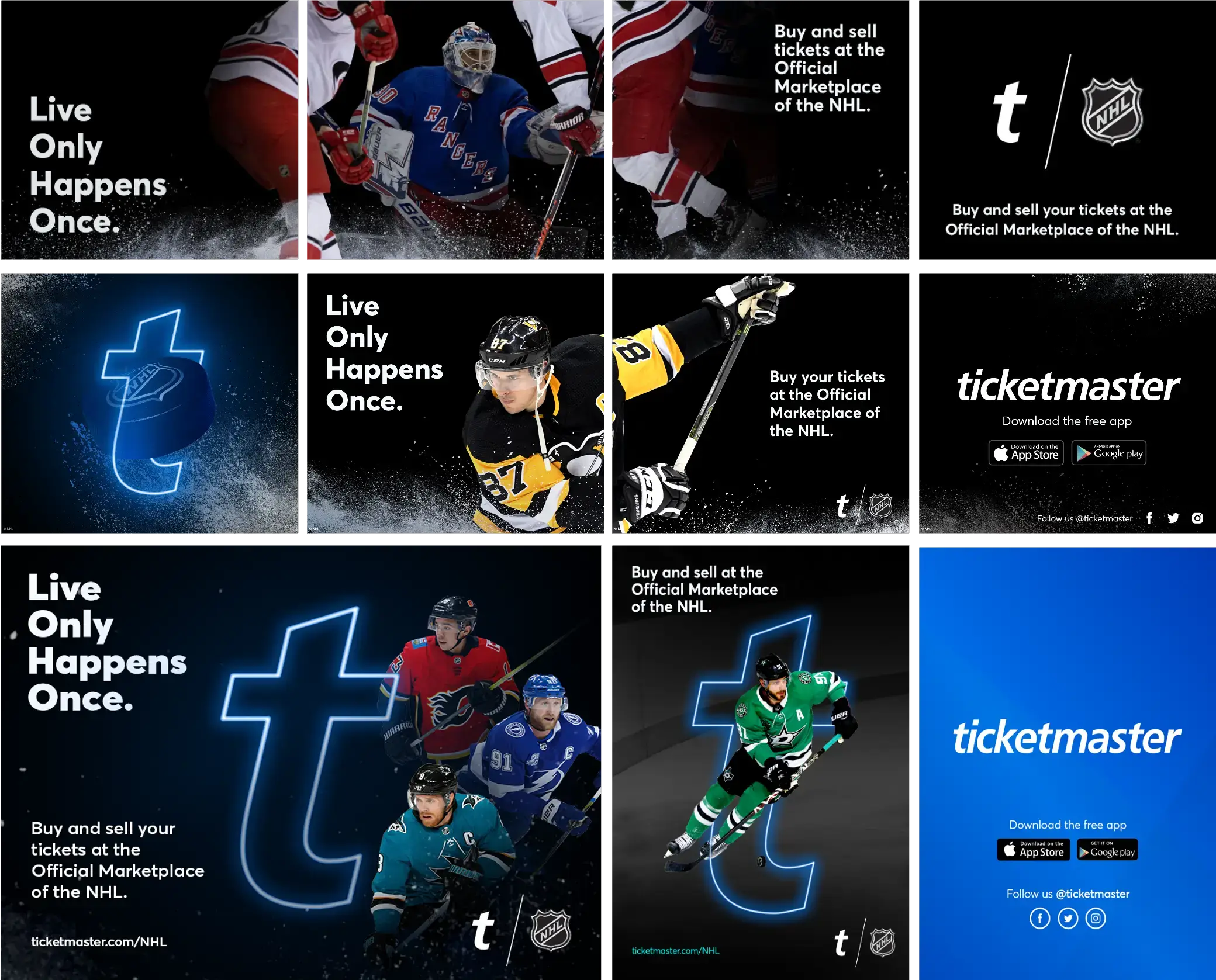
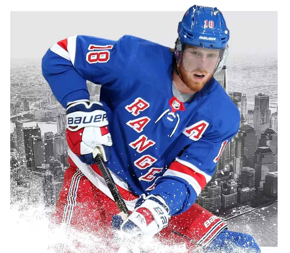
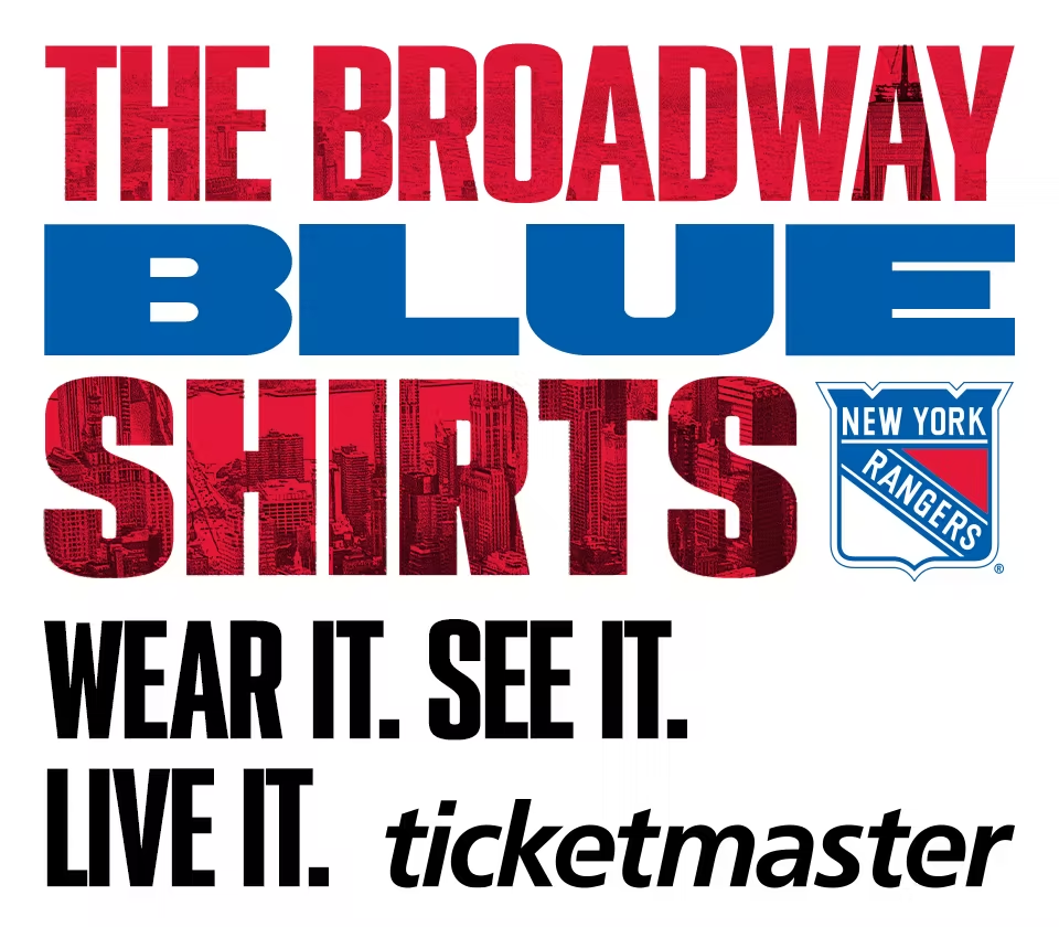
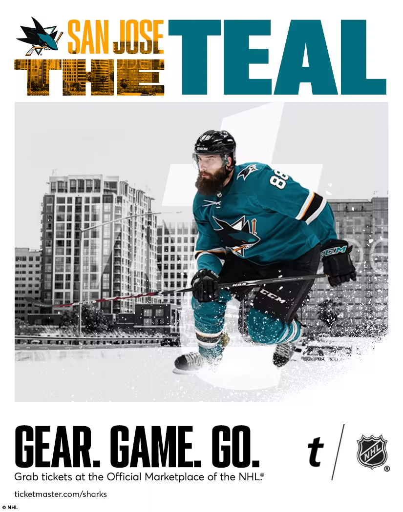
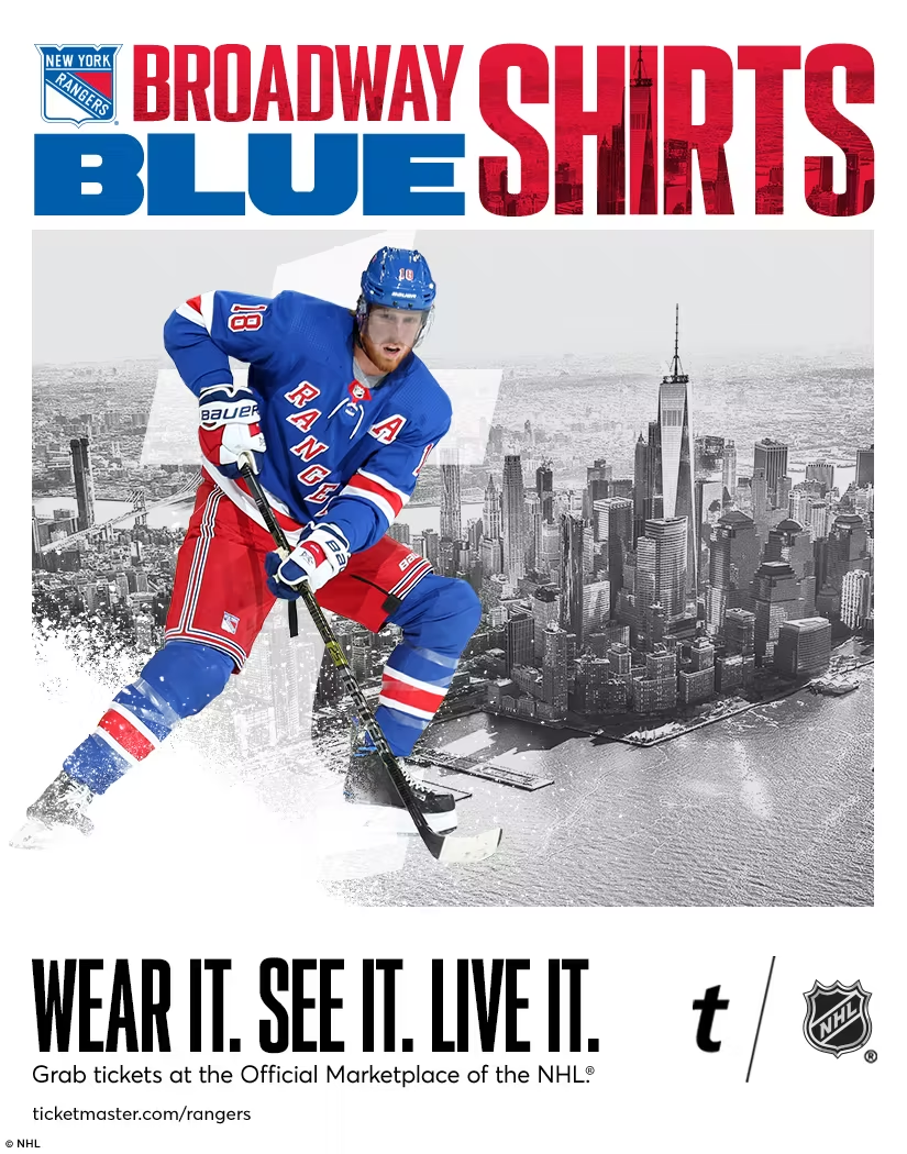
Passion isn’t passive—it’s electric. Our challenge was merging Fanatics’ energy with Ticketmaster’s precision to create a system that doesn’t just promote live sports but immerses fans in it. Every composition is built with intent: bold type amplifies excitement, players break through frames to heighten presence, and contrast drives focus to the action. This isn’t just a campaign—it’s a visual experience that puts fans inside the moment, making every placement feel like a seat at the game.
Aligning Multiple Brands //
Unifying the visual language of three to four distinct brands under one umbrella is no easy feat. We had to navigate legacy aesthetics, team identities, and retailer expectations while ensuring a seamless, recognizable look. Striking the right balance between individuality and cohesion became the ultimate design challenge—one where consistency couldn’t come at the expense of character.
tm_fantatics_1_process_2
tm_fantatics_1_process_13
tm_fantatics_1_process_8
tm_fantatics_1_process_12
tm_fantatics_1_process_15
tm_fantatics_1_process_18
tm_fantatics_1_process_16
tm_fantatics_1_process_7
tm_fantatics_1_process_5
tm_fantatics_1_process_11
tm_fantatics_1_process_1
tm_fantatics_1_process_6
tm_fantatics_1_process_3
tm_fantatics_1_process_17
tm_fantatics_1_process_10
tm_fantatics_1_process_4
tm_fantatics_1_process_9
tm_fantatics_1_process_14

Approved Visual Style

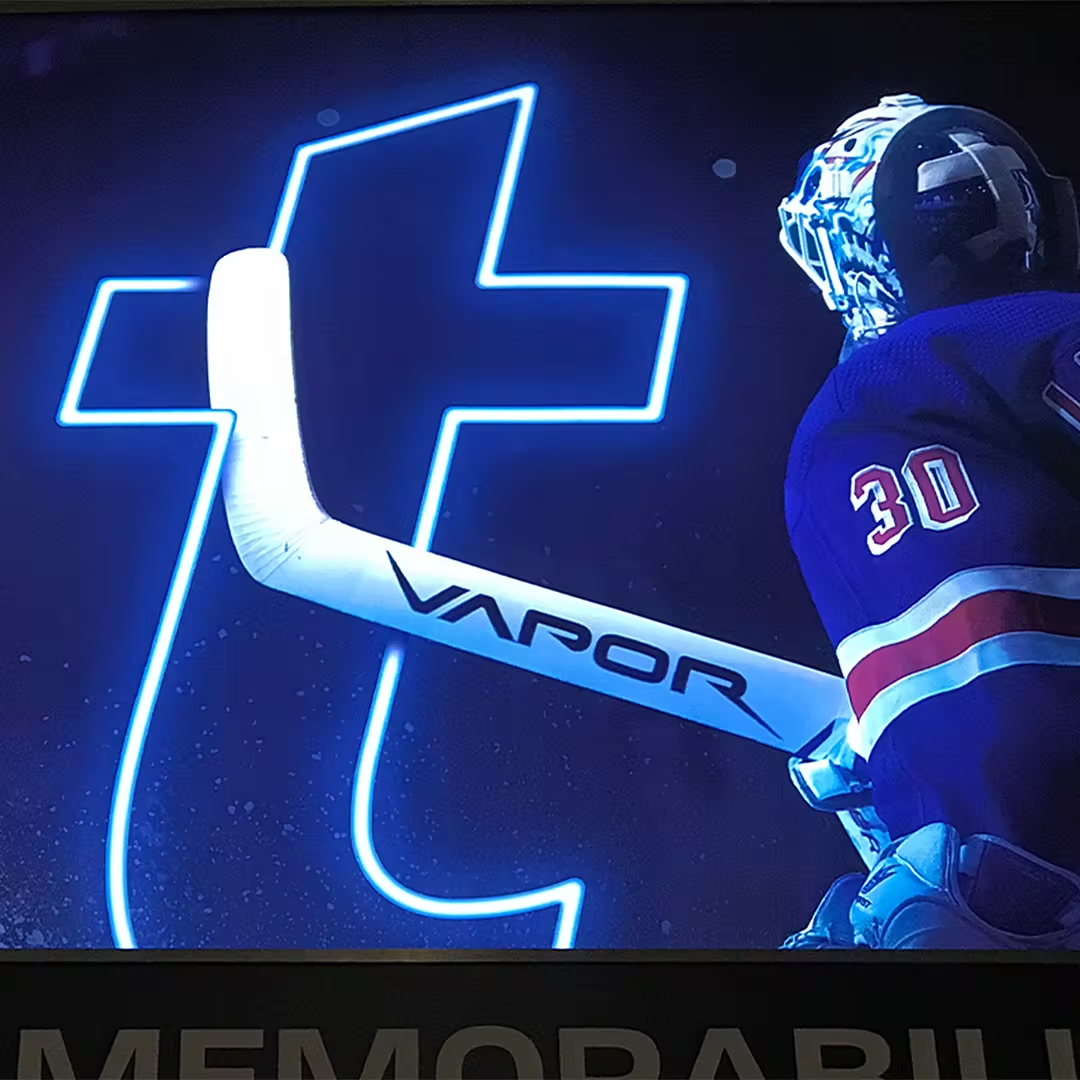
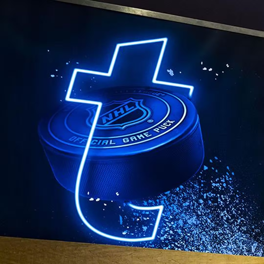
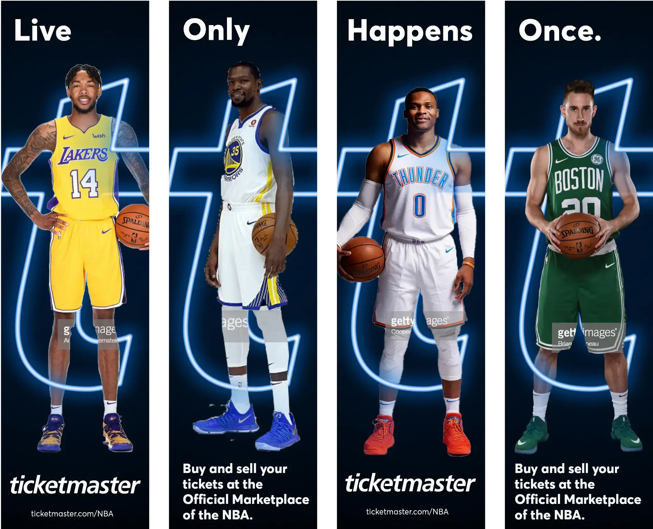
Neon "T"
Concept

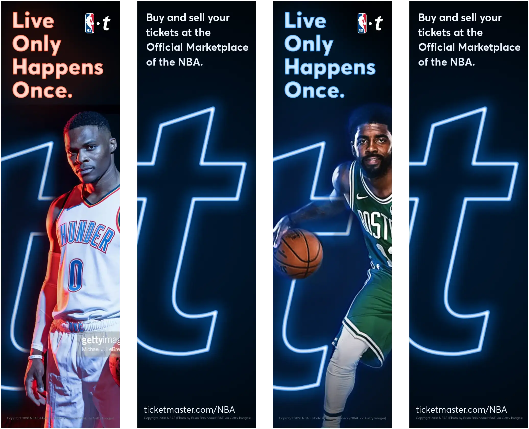
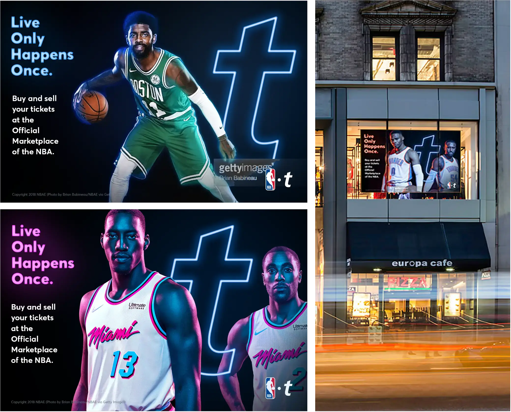
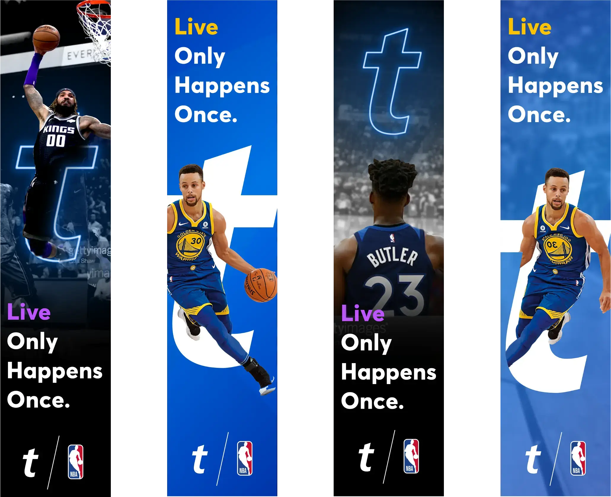
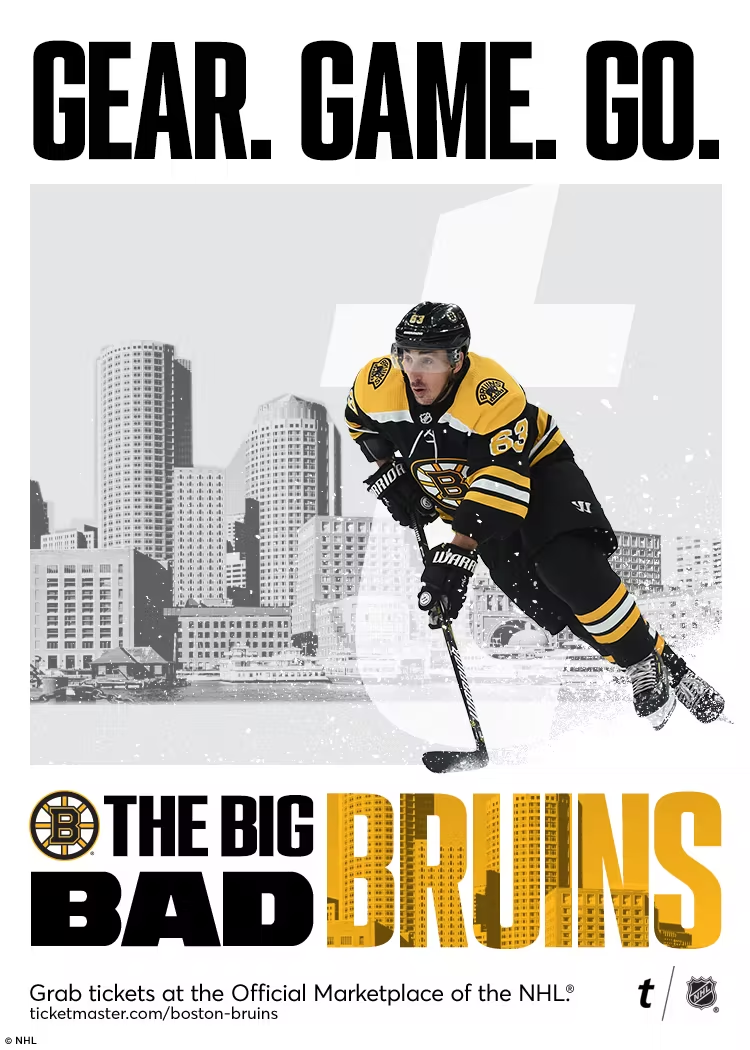
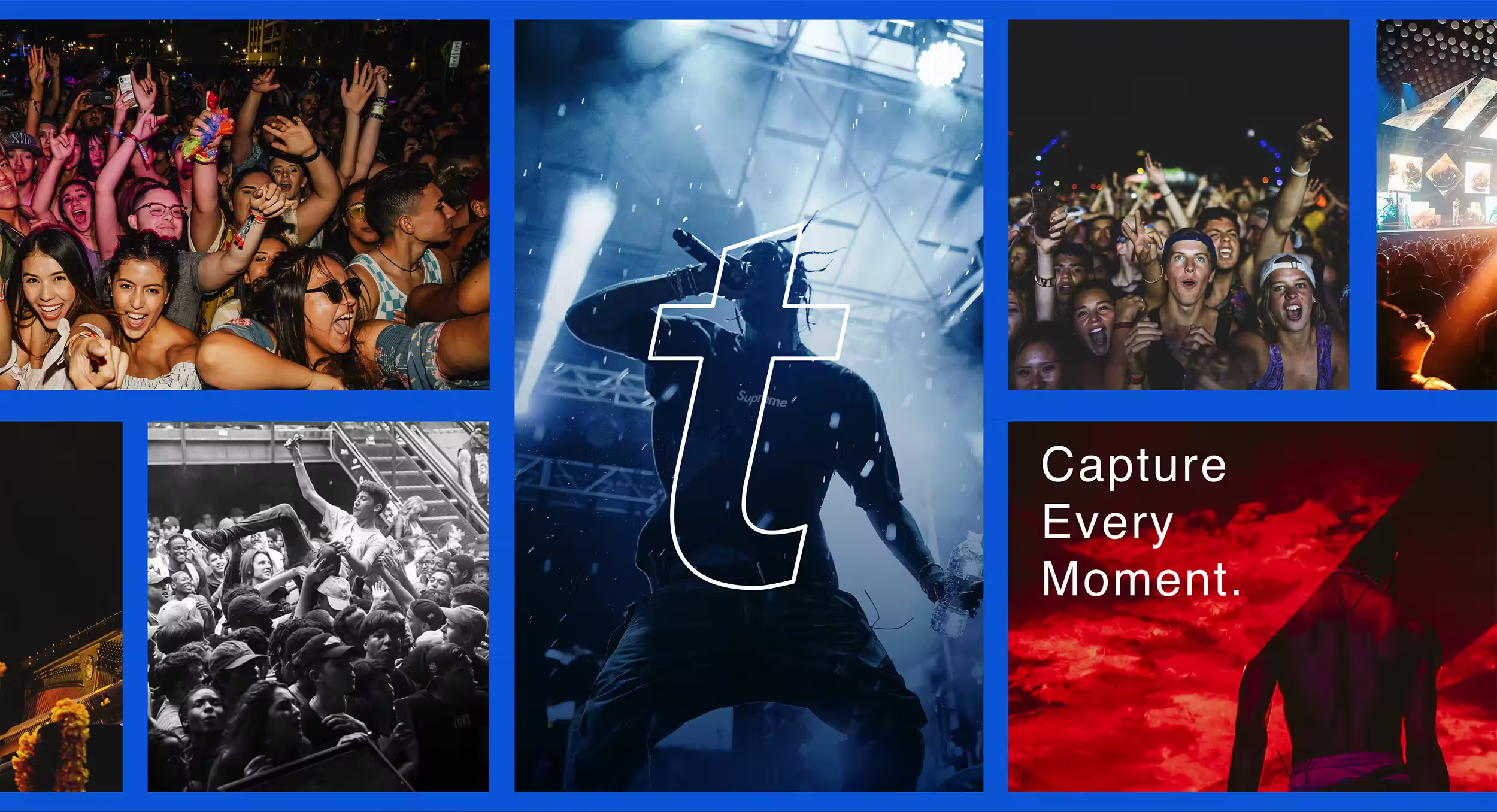
The Neon T is more than a design element—it’s Ticketmaster’s way of framing the moments fans live for. By using it to spotlight players in defining action, it transforms into a portal, capturing the energy, anticipation, and thrill of being there. It’s not just a graphic; it’s the gateway to the experience every fan wants.

Final Project Delivery
Proofing for Precision //
Before the final rollout, every element had to be pressure-tested. Printing proofs weren’t just about color accuracy—they ensured scale, contrast, and materials upheld the energy of the design. Every detail was fine-tuned to guarantee the final execution delivered exactly as envisioned, with no surprises.
Finish Line //
Delivery day was a full-court press. Coordinating between LA and a print shop in NYC, we had one shot to get it right. Every install, every adjustment, every second counted. In just 24 hours, the vision became reality—live, larger-than-life, and impossible to ignore. The pressure was relentless, but so was the execution.
tm_takeover_final7-re-touched
nhl_takeover_0008
nhl_takeover_0006
tm_takeover_final1-re-touched
nhl_takeover_0009
nhl_takeover_0002
tm_takeover_final9-re-touched
nhl_takeover_0007
nhl_takeover_0011

Fall Takeover Part II

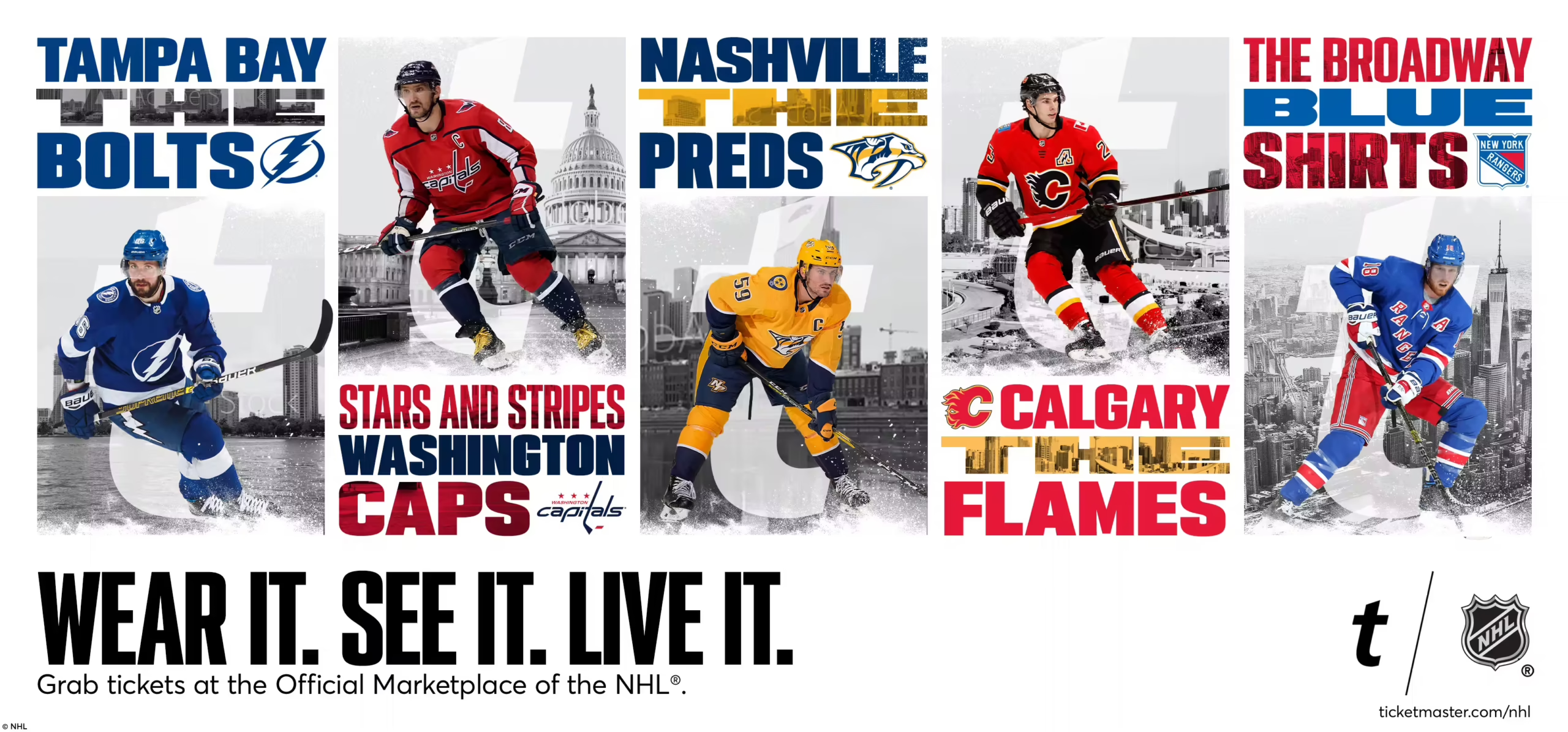
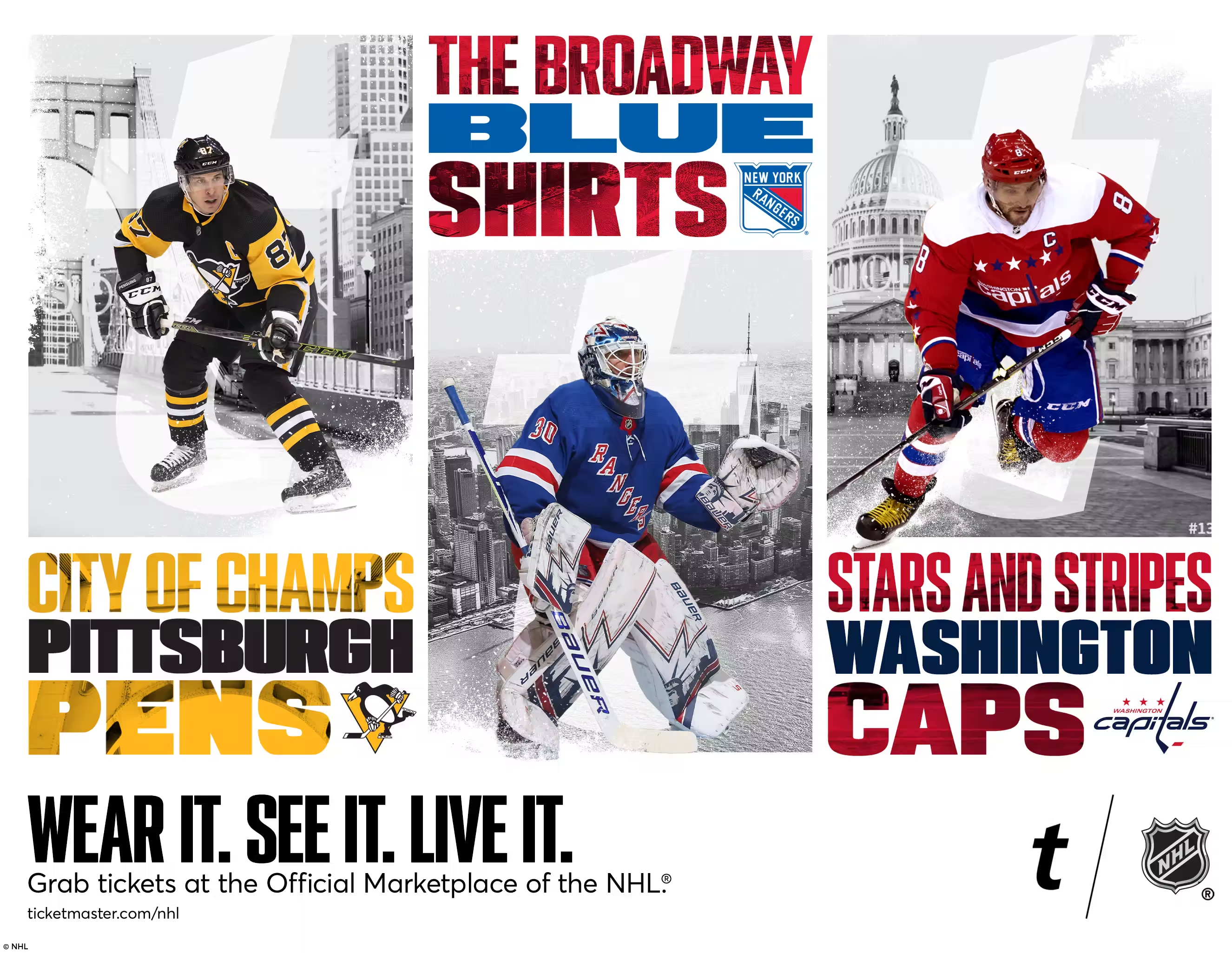
Following the success of the initial Fanatics store takeover, Ticketmaster once again partnered with us to craft a fresh and engaging retail experience. With a focus on deepening the connection between teams, cities, and fans, the next phase required a concept that would resonate beyond the walls of the store.

City Reign Concept// 
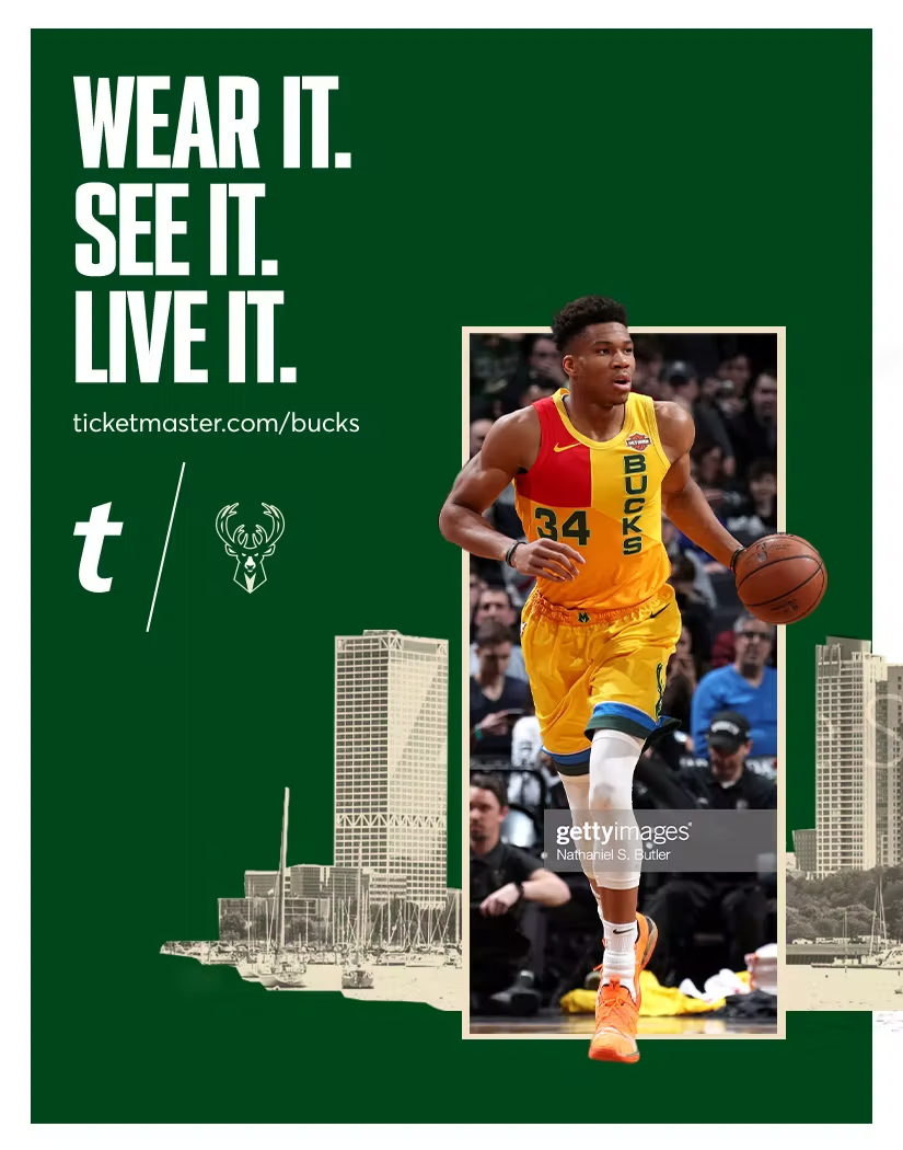
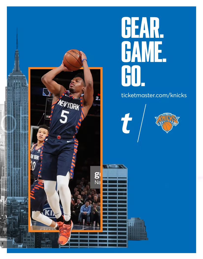
Team pride isn’t just worn—it’s lived. The skyline, the streets, the roar of the crowd—it all fuels the game. This campaign captures that energy, turning hometown loyalty into something bold, immersive, and unmistakable. Bold visuals, iconic landmarks, and dynamic storytelling bring every city’s legacy to life—because here, the team, the fans, and the city stand as one. This isn’t just a game. It’s their kingdom.
FINAL EXECUTION//
While this project had all the energy and vision to make a major impact, sometimes the game changes. Due to budget constraints, the initiative was discontinued before launch. Even though it didn’t hit the streets, the concept remains a testament to the passion, creativity, and city-driven spirit that fueled it. Some ideas may not make it to the finish line, but their influence lives on.

Visual Development

Window Signage

Window Signage

Window Signage
Window Signage
Window Signage
tm_fantatics_nba_45th_Street_192x119
tm_fantatics_nba_5th_Ave_181x119

Tall Window Signage

Tall Window Signage

Tall Window Signage

Tall Window Signage

Tall Window Signage

tm_fantatics_nba_45th_Street_50x180_4
tm_fantatics_nba_45th_Street_50x180_3
tm_fantatics_nba_45th_Street_50x180_2
tm_fantatics_nba_45th_Street_50x180_1

3 Tier Signage

3 Tier Signage

3 Tier Signage

3 Tier Signage

3 Tier Signage

tm_fantatics_nba_Tier3_22x28
tm_fantatics_nba_Tier2_22x28
tm_fantatics_nba_Tier1_22x28_

In-Store Takeaways

In-Store Takeaways

In-Store Takeaways

In-Store Takeaways

In-Store Takeaways

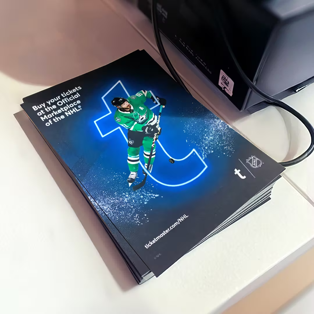
tm_fantatics_nba_HandOut_5x7
Front
NBA_internal_HandOut_5x7
Back

Window Signage

Window Signage

Window Signage
Window Signage

Window Signage

tm_fantatics_nhl_part2_Hanging_Sign_180x84
tm_fantatics_nhl_part2_Window_Signage106x82

Light Boxes

Light Boxes

Light Boxes

Light Boxes

Light Boxes

tm_fantatics_nhl_part2_Lightbox_1
tm_fantatics_nhl_part2_Lightbox_2
tm_fantatics_nhl_part2_Lightbox_3
tm_fantatics_nhl_part2_Lightbox_4

Triple Teir Signage

Triple Teir Signage

Triple Teir Signage

Triple Teir Signage

Triple Teir Signage

tm_fantatics_nhl_part2_Tier3_22x28
tm_fantatics_nhl_part2_Tier2_22x28
tm_fantatics_nhl_part2_Tier1_22x28_

In-Store Takeaways

In-Store Takeaways

In-Store Takeaways

In-Store Takeaways

In-Store Takeaways

tm_fantatics_nhl_part2_HandOut_5x7
FRONT
NHL_HandOut_inside_5x7
BACK

02

Digital
Advertising

Digital advertising plays a crucial role in connecting fans to live events, transforming interest into action. For leagues, teams, and entertainment partners, every ad had to do more than promote—it had to engage, inform, and drive conversions. Our approach ensured that digital campaigns were not just seen, but felt, delivering impact across every platform.

ASSIGNMENT //
Develop a scalable digital ad system for Ticketmaster’s sports and entertainment partners, including the NHL, NBA, NFL, and Live Nation. Beyond Ticketmaster’s own campaigns, we also fulfilled ad requests from individual partners, ensuring their unique branding and promotional needs were met within a cohesive framework. The challenge was to create adaptable, high-performing campaigns that aligned with partner branding while optimizing engagement and conversion across social, display, and programmatic channels.
DELIVERABLES //
Dynamic ad templates, platform-specific social media ads (X/Twitter, Facebook, Instagram), display banners (static, animated, HTML5), event-specific campaigns for playoffs and marquee games, last-minute ticket pushes utilizing real-time inventory data, partner-specific customizations for teams and venues, web takeovers on high-traffic sports sites, premium placements on ESPN and Bleacher Report, YouTube pre-roll ads, Google Display Network retargeting, programmatic advertising.
Process //
Campaign development started with strategic planning to align creative execution with partner goals. Modular ad templates allowed seamless adaptation across leagues and teams while maintaining brand identity. Motion design was integrated early to enhance key messaging. A/B testing and audience response data informed real-time refinements. Daily and weekly updates ensured assets stayed relevant, adjusting to shifting schedules, performance insights, and emerging trends. Collaboration across creative, marketing, and data teams kept campaigns tailored yet cohesive while allowing for ongoing optimizations.
Role //
Contributed to the creative execution of digital ad campaigns, assisted in refining adaptable design systems, worked closely with motion designers on dynamic visuals and motion direction, collaborated with marketing, product, and league stakeholders to refine messaging and optimize assets, supported seamless deployment across platforms, facilitated feedback loops, tracked performance, and iterated improvements to maximize engagement and conversions.

Messaging Hierarchy

Brand

LIVE ONLY HAPPENS ONCE.

iconmonstr-arrow-down-thin
Sports League / Live Nation

Define and establish Ticketmaster’s position with the League, Live Nation, or Partner by highlighting the unique benefits of the value proposition that will resonate with the target customer.

iconmonstr-arrow-down-thin
Team / Artist / Event

Define and establish Ticketmaster’s position with teams, artists, and events by highlighting the unique benefits of the value proposition that create relevance and authenticity, drawing passion from fans for their favorite team, artist, or live experience.

iconmonstr-arrow-down-thin
Call To Action

Drive the desired reaction from buyers/sellers across the funnel and through various platforms.

Creative Buckets

Ticketed Partner //
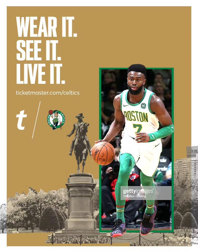
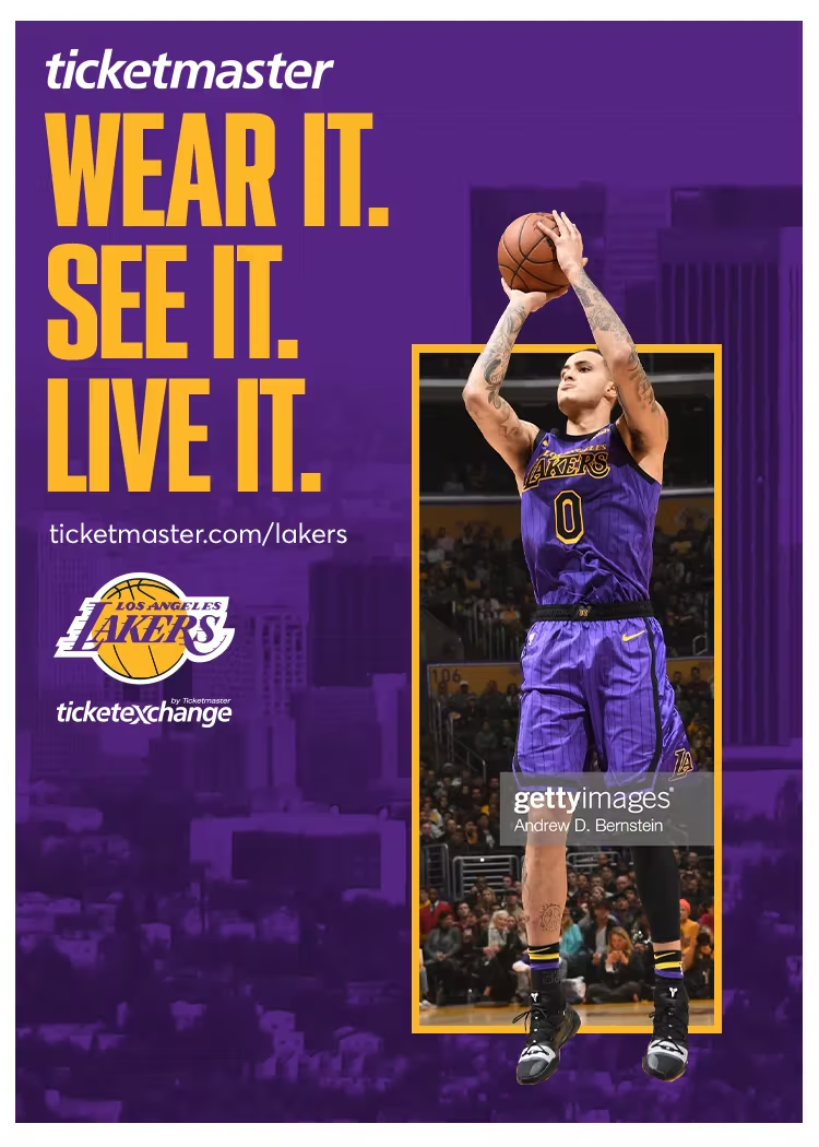
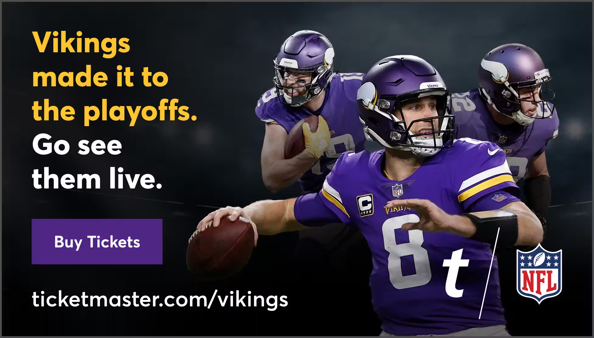
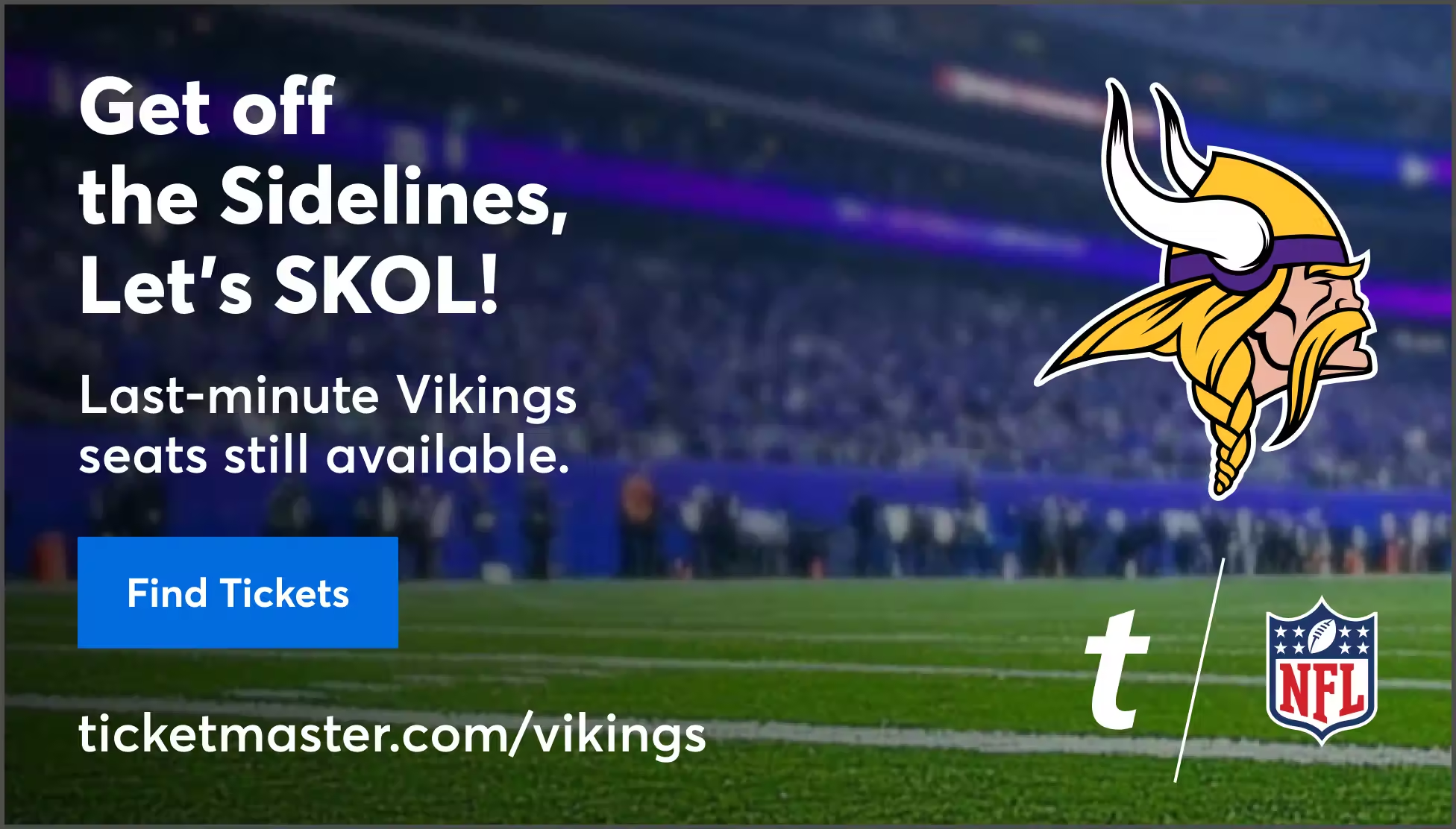
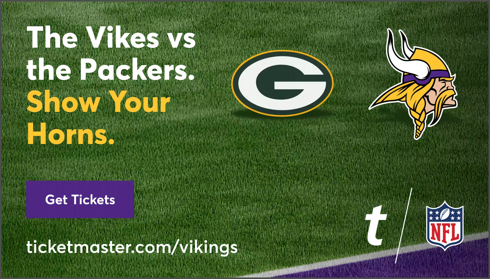
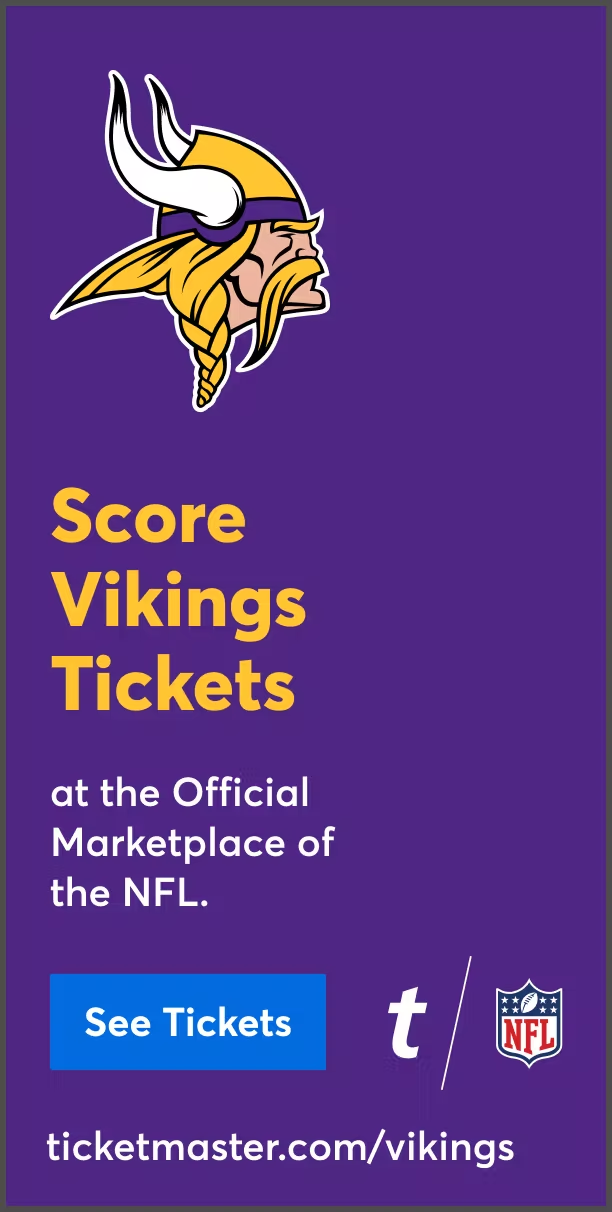
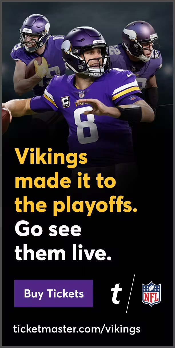
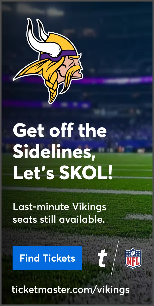
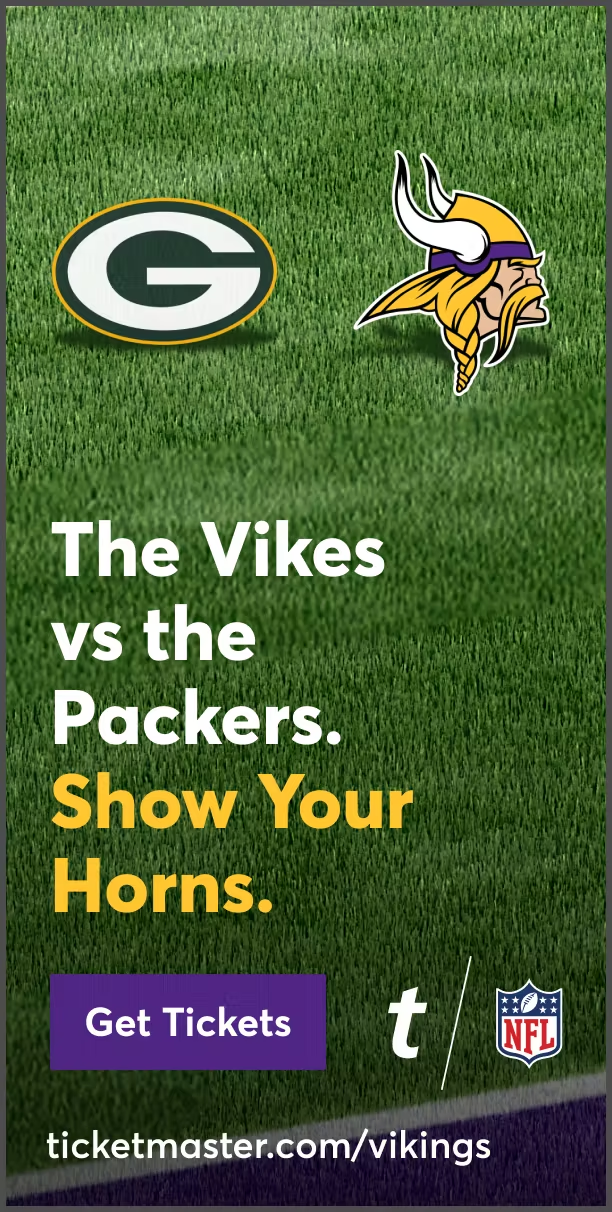
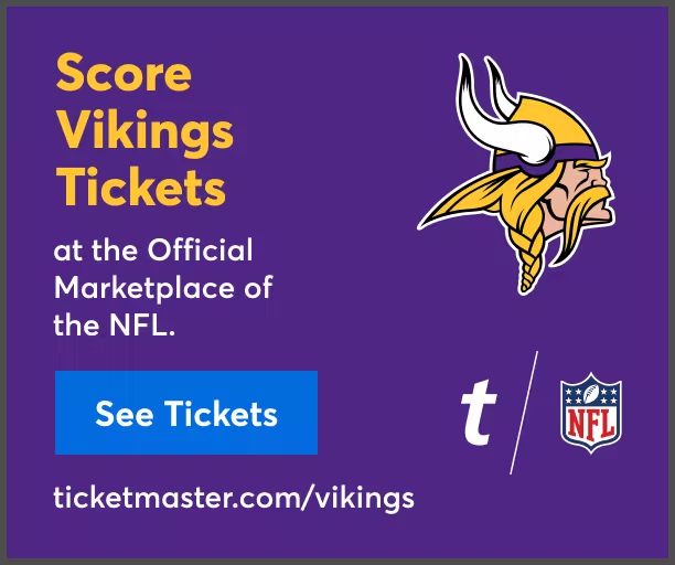
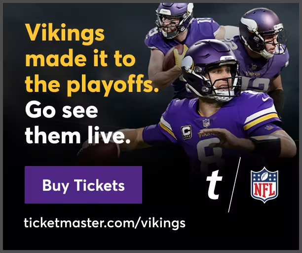
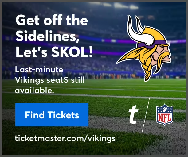
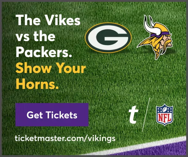
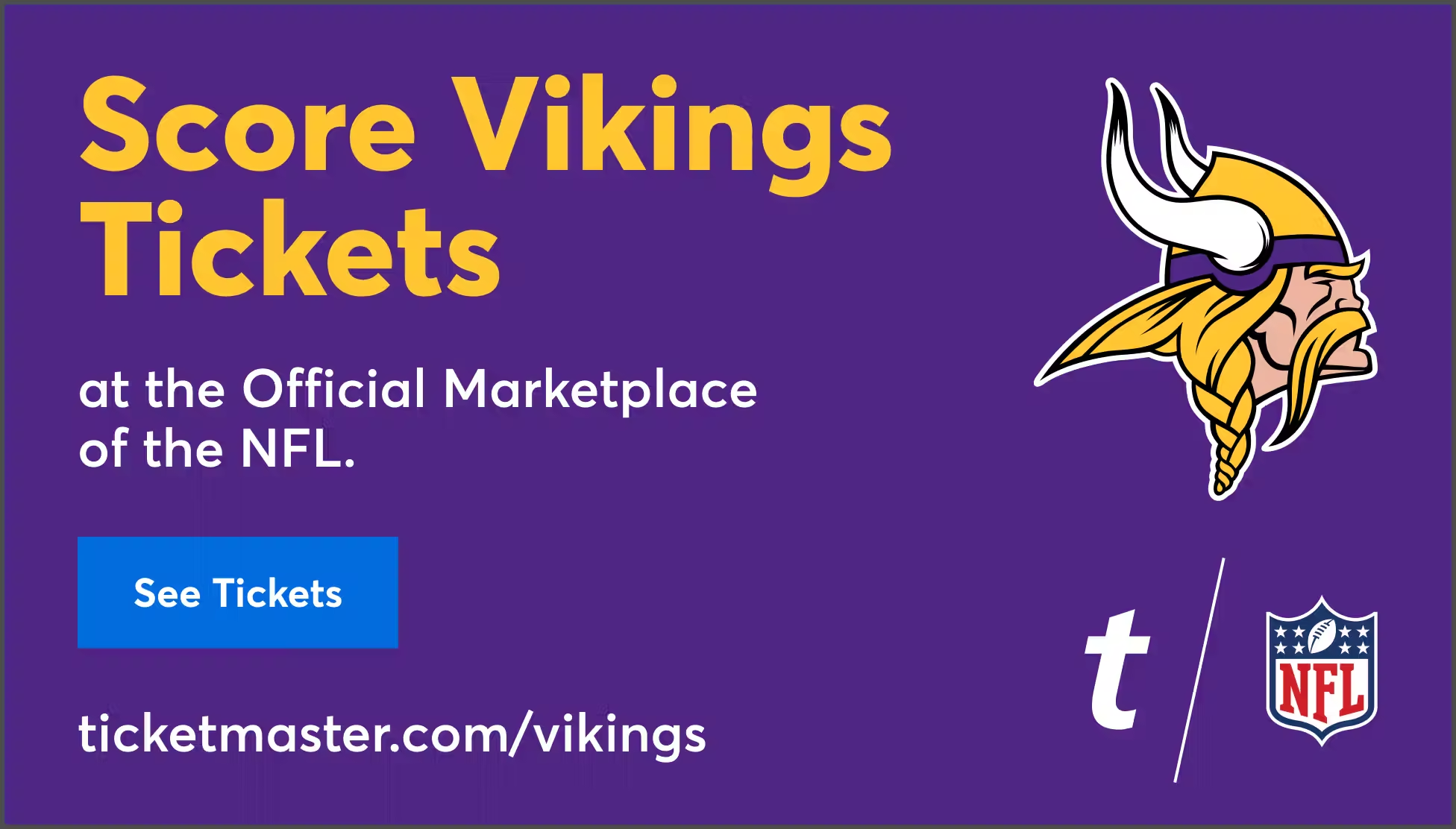
When Ticketmaster was the official ticketing partner, creative had the advantage of full access—team branding, player imagery, official assets. These weren’t just promotions; they were extensions of the team’s identity, giving fans a seamless, familiar experience while reinforcing Ticketmaster as the trusted source for game-day access.
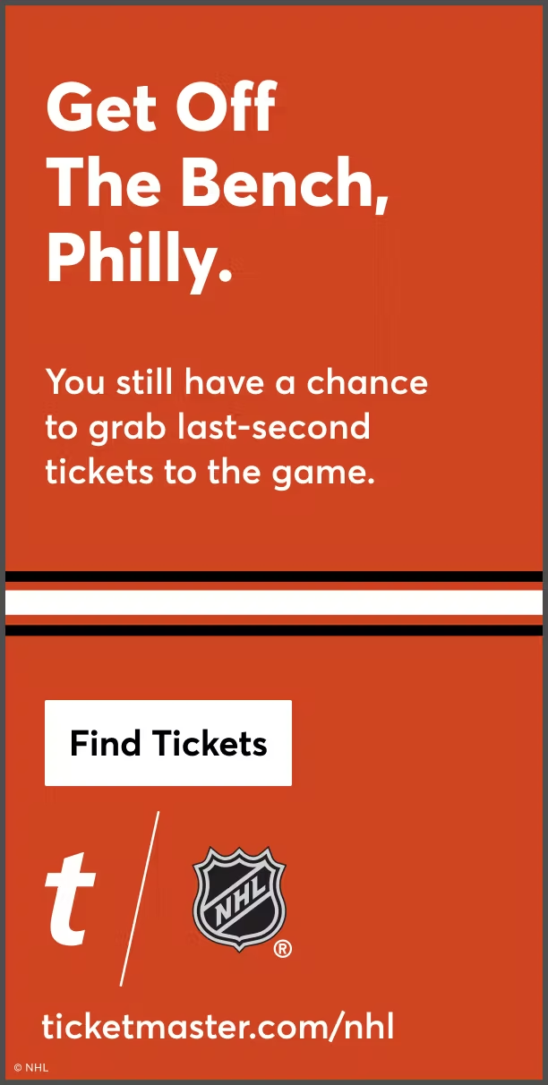
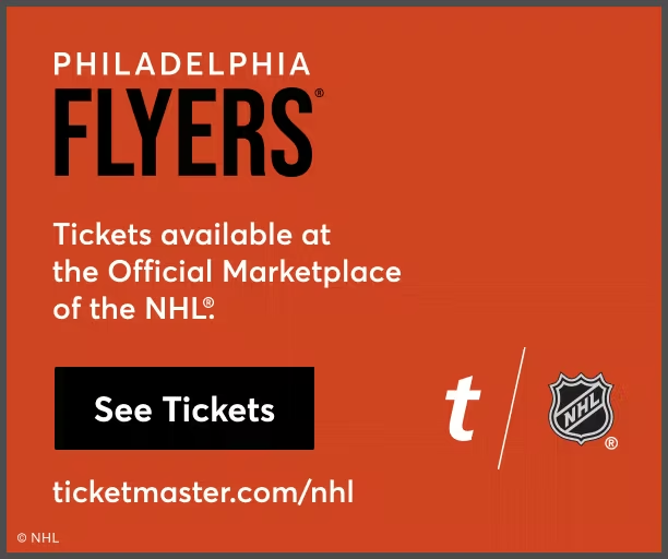
THIRd Party Ecommerce //
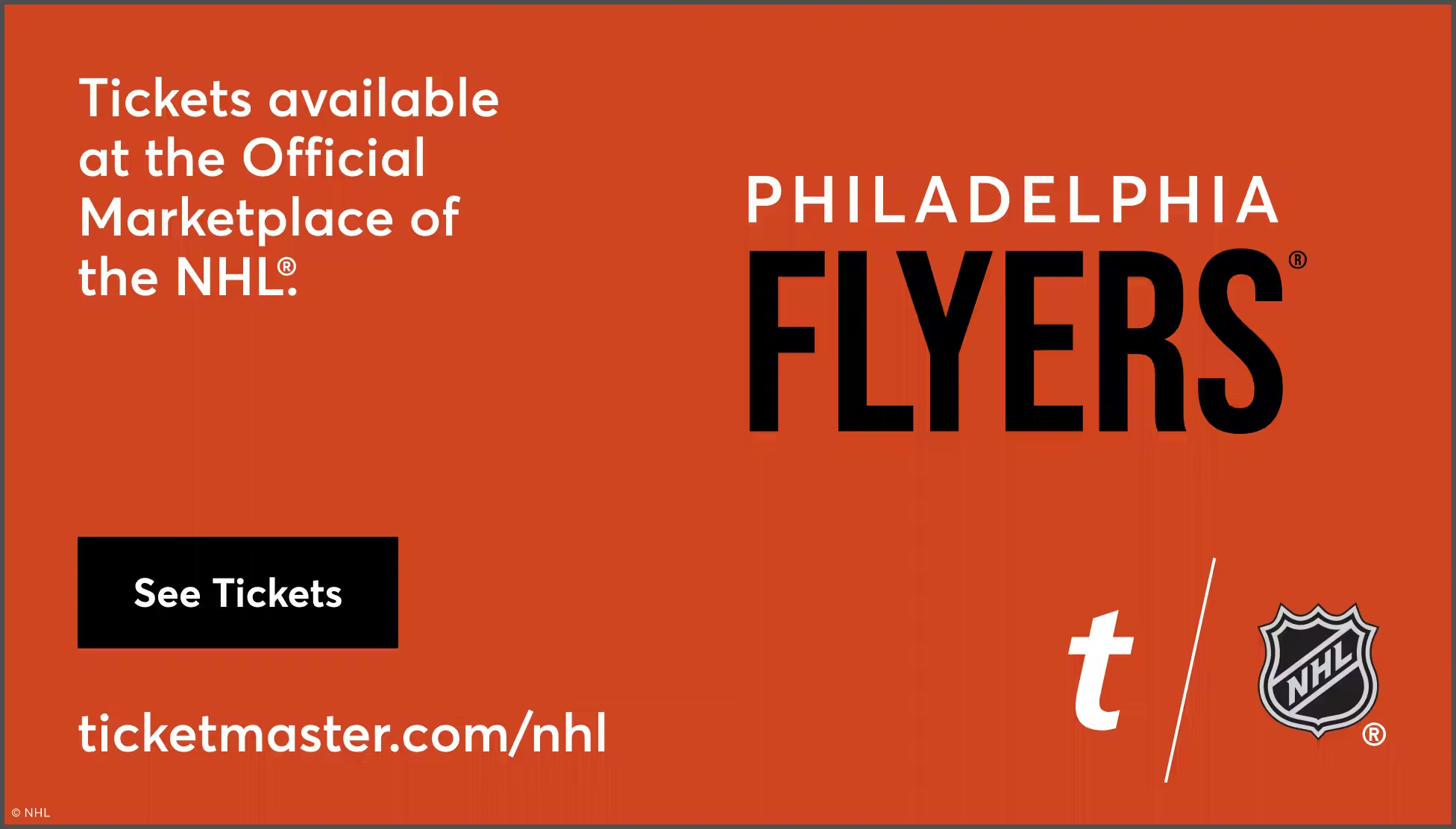
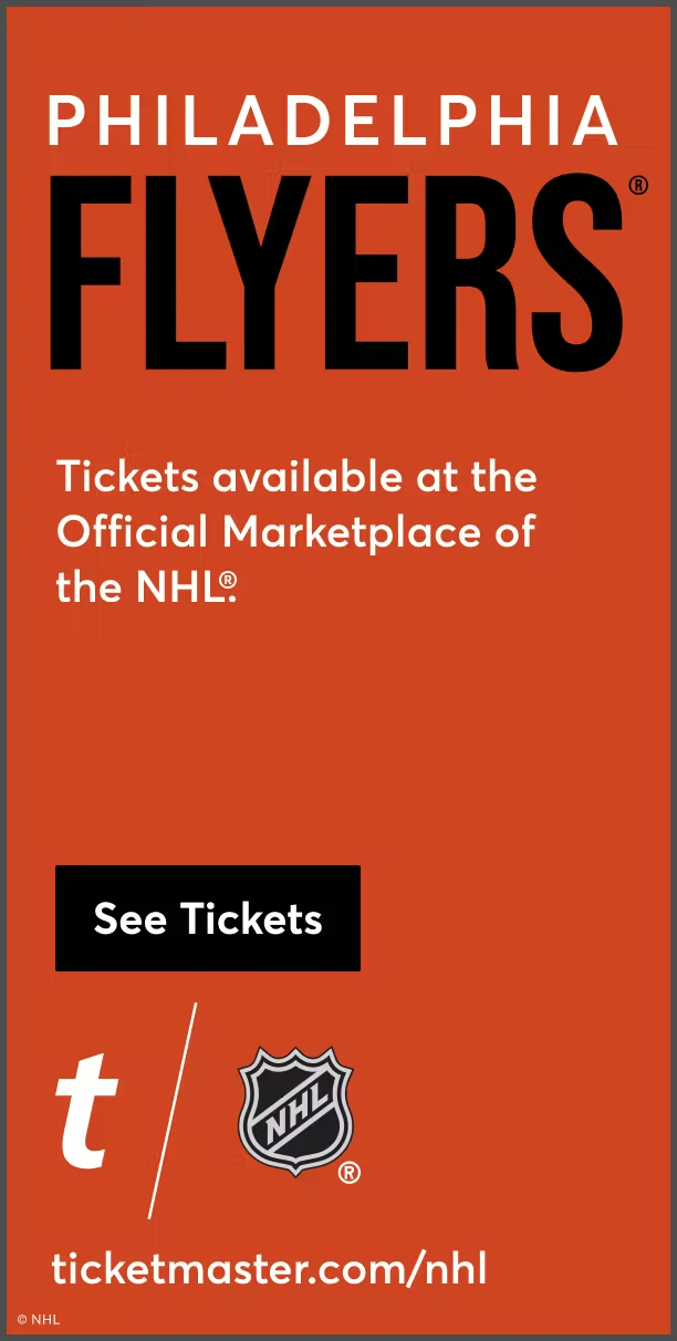
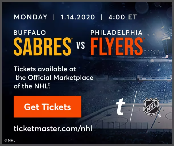
When selling tickets for teams not directly partnered with Ticketmaster, creativity had to work within restrictions. No logos. No official imagery. Just bold colors, strong typography, and messaging that connected the dots for fans, ensuring they recognized Ticketmaster as a reliable source while maintaining neutrality across competing marketplaces.
Agnostic //
The agnostic campaign was designed to represent the league as a whole rather than any single team. Creative leaned into universal symbols of the game—star players from multiple teams, a packed stadium under the lights, a game ball mid-air. The goal was to craft a narrative that resonated with every fan, regardless of allegiance.
Testing layouts //
Each ad was built with creativity and data in mind; it was a data-driven asset refined through continuous testing. A/B testing helped compare variations in messaging, visuals, and CTAs, ensuring maximum engagement. For example, shorter copy often improved click-through rates, while testing CTA button color versus copy revealed how subtle design shifts impacted conversions. Real-time performance tracking guided adjustments, keeping campaigns responsive to audience behavior and platform trends.

Sports Messaging Buckets

Evergreen //
Year-round campaigns maintaining brand visibility, driving steady engagement, and reinforcing awareness through consistent messaging and promotions. Designed to sustain long-term fan interest, these ads keep audiences informed about upcoming games, ticket availability, and special offers.
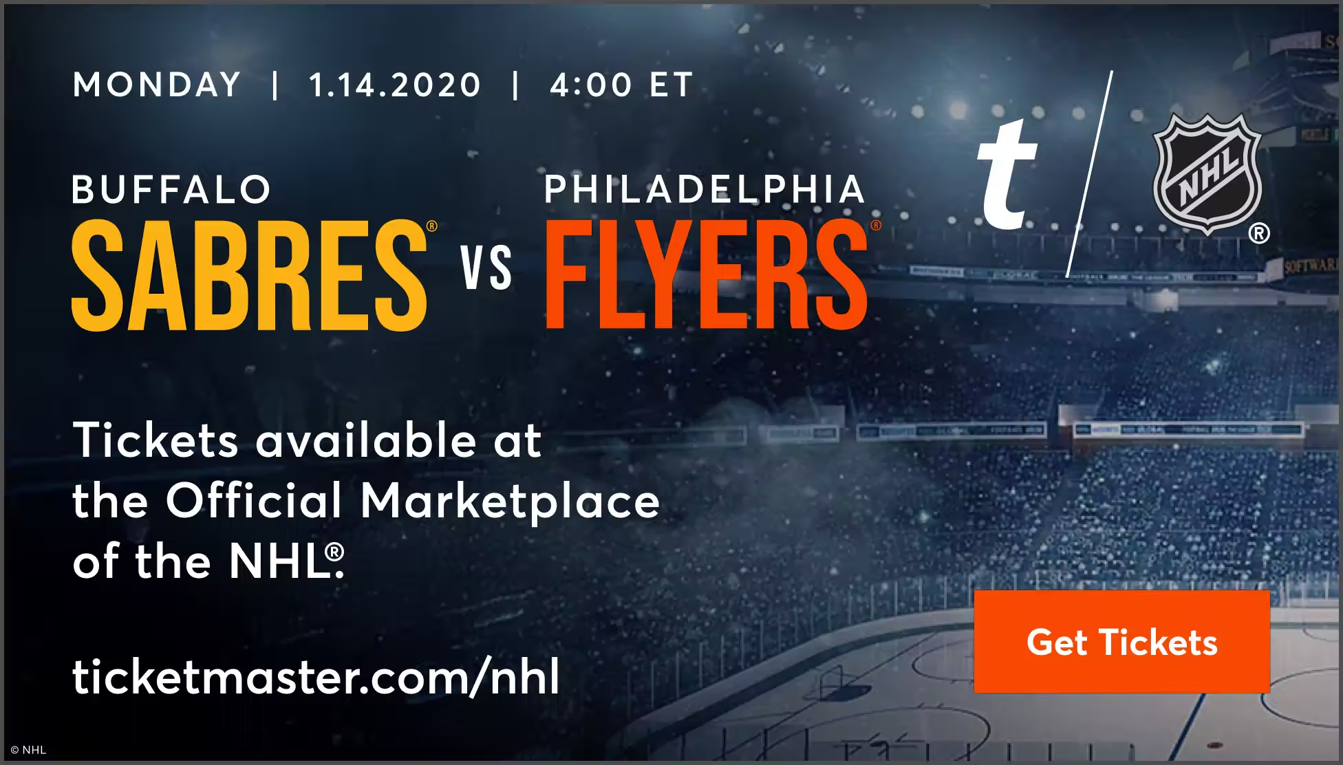
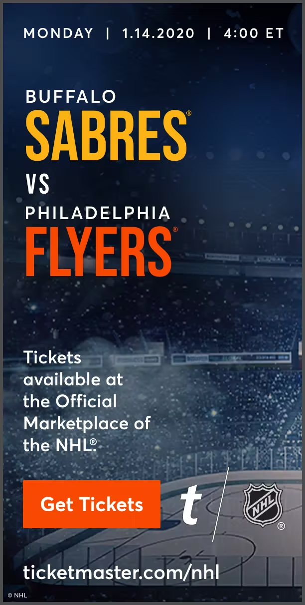
Hot Match Ups //
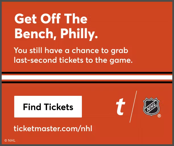
Focused campaigns built around marquee games, leveraging team rivalries, superstar matchups, and historical narratives. These ads tap into fan anticipation, using compelling visuals and dynamic messaging to generate excitement, increase engagement, and drive ticket purchases.
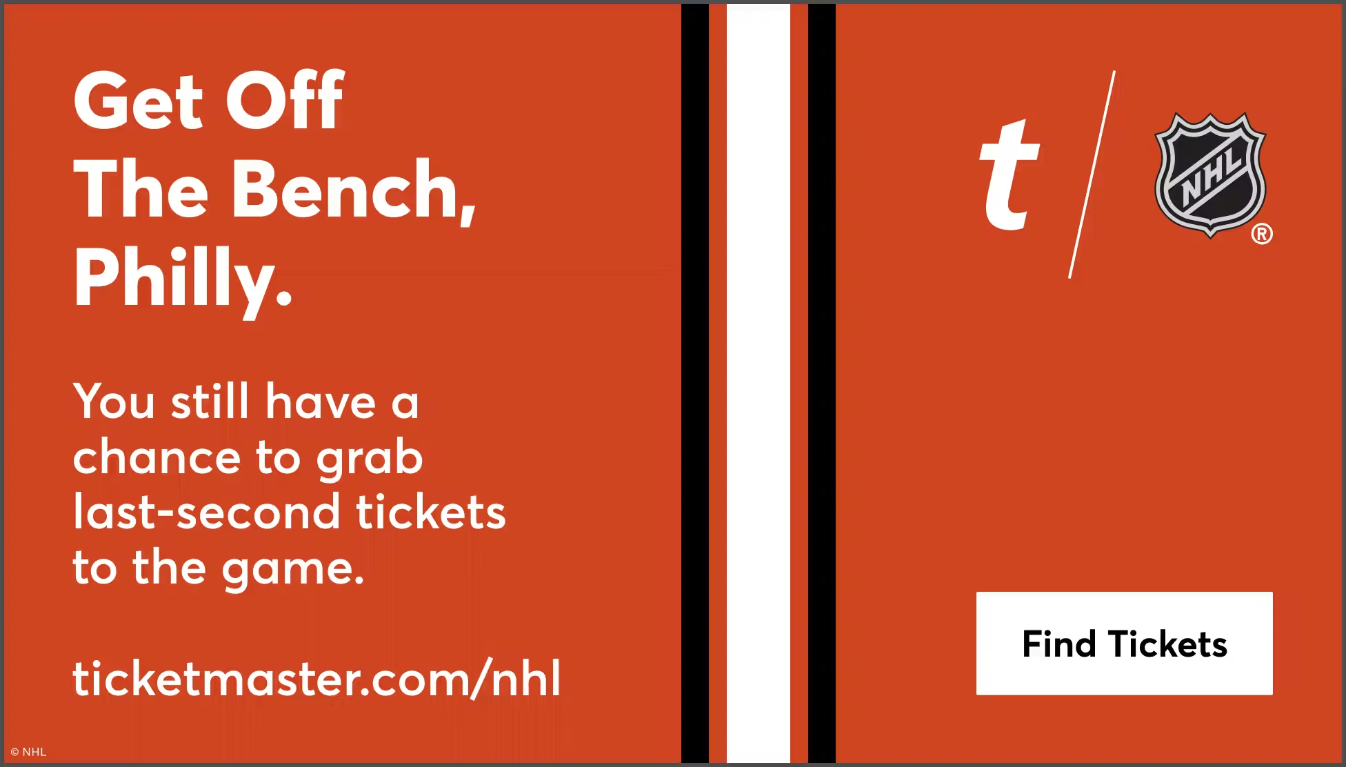
Last Minute Tickets //
High-urgency creative targeting spontaneous buyers, leveraging countdown clocks, real-time ticket availability, and flash promotions. These ads are optimized to convert last-minute decision-makers by emphasizing limited availability and exclusive offers to drive immediate sales.
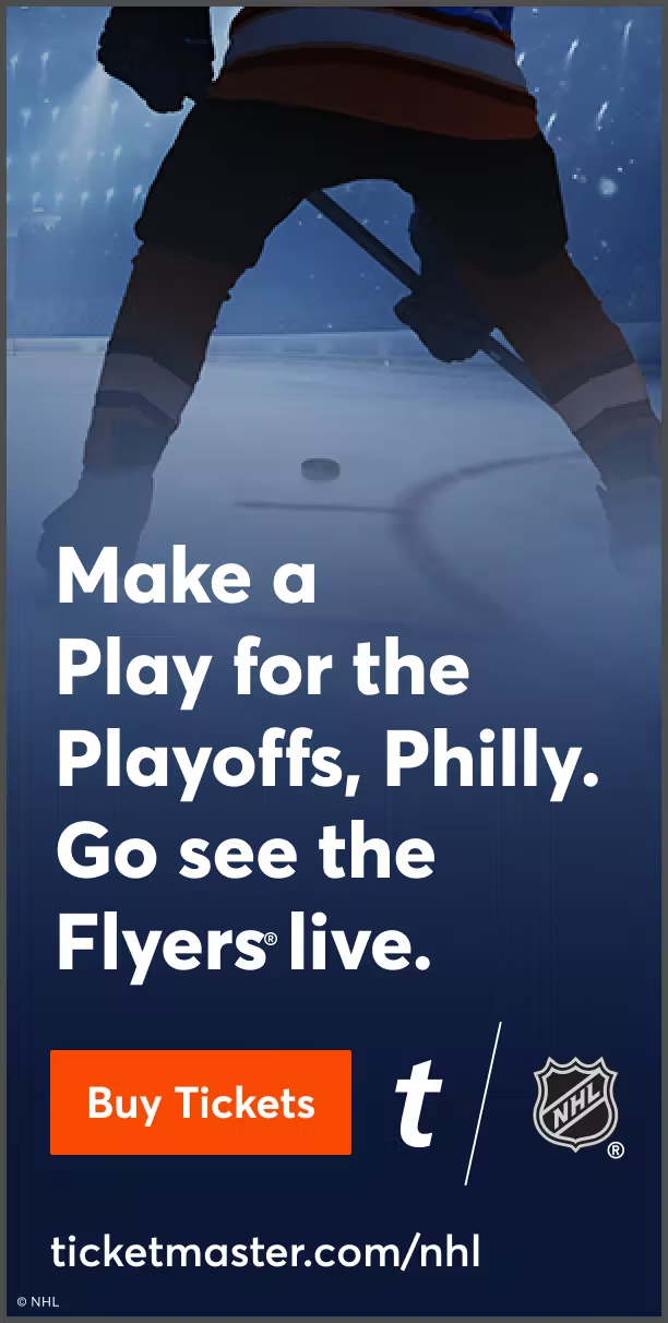
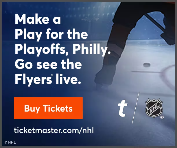
Post Season //
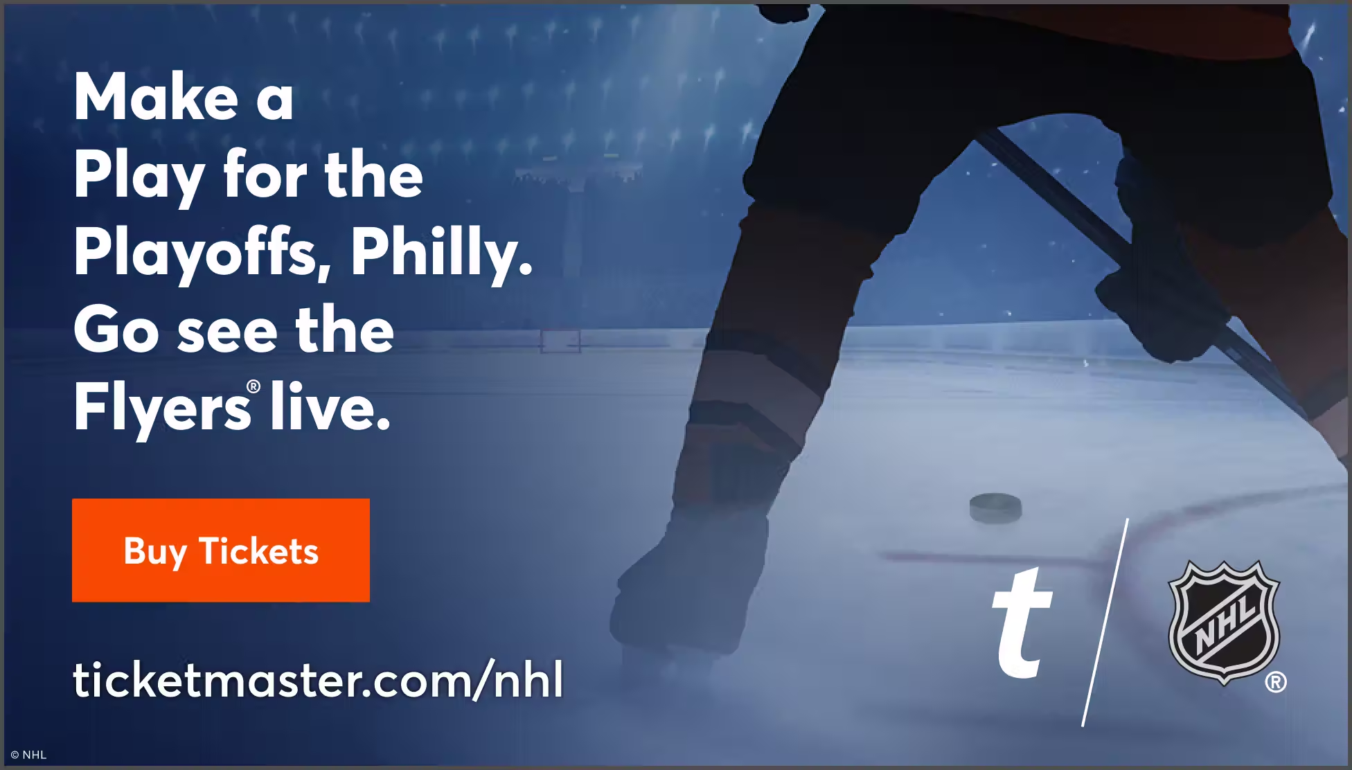
Tailored ads capturing the energy of high-stakes matchups, designed to elevate fan enthusiasm as teams compete for championships. Using momentum-driven storytelling and real-time updates, these campaigns maximize conversions and reinforce the emotional pull of postseason action.

Ticketed Partner Layouts

970x550

970x550

970x550
970x550
970x550
FINAL-EVG_TM_Vikings_970x550
EVG
FINAL-POST_TM_Vikings_970x550
POST
FINAL-LMT_TM_Vikings_970x550
LMT
FINAL-HMU_TM_Vikings_970x550
HMU

970x250

970x250

970x250
970x250
970x250
FINAL-EVG_TM_Vikings_970x250
EVG
FINAL-POST_TM_Vikings_970x250
POST
FINAL-LMT_TM_Vikings_970x250
LMT
FINAL-HMU_TM_Vikings_970x250
HMU

300x600

300x600

300x600
300x600
300x600
FINAL-EVG_TM_Vikings_300x600
EVG
FINAL-POST_TM_Vikings_300x600
POST
FINAL-LMT_TM_Vikings_300x600
LMT
FINAL-HMU_TM_Vikings_300x600
HMU

160x600

160x600

160x600
160x600
160x600
FINAL-EVG_TM_Vikings_150x600
EVG
FINAL-POST_TM_Vikings_150x600
POST
FINAL-LMT_TM_Vikings_150x600
LMT
FINAL-HMU_TM_Vikings_150x600
HMU

728x90

728x90

728x90
728x90
728x90
FINAL-EVG_TM_Vikings_728x90
EVG
FINAL-POST_TM_Vikings_728x90
POST
FINAL-LMT_TM_Vikings_728x90
LMT
FINAL-HMU_TM_Vikings_728x90
HMU

300x250

300x250

300x250
300x250
300x250
FINAL-EVG_TM_Vikings_300x250
EVG
FINAL-POST_TM_Vikings_300x250
POST
FINAL-LMT_TM_Vikings_300x250
LMT
FINAL-HMU_TM_Vikings_300x250
HMU

320x50

320x50

320x50
320x50
320x50
FINAL-EVG_TM_Vikings_320x50
EVG
FINAL-POST_TM_Vikings_320x50
POST
FINAL-LMT_TM_Vikings_320x50
LMT
FINAL-HMU_TM_Vikings_320x50
HMU

Third Party Layout

970x550

970x550

970x550
970x550
970x550
FINAL-EVG_TM_Flyers_970x550
EVG
FINAL-POST_TM_Flyers_970x550
POST
FINAL-LMT_TM_Flyers_970x550
LMT
FINAL-HMU_TM_Flyers_970x550
HMU

970x250

970x250

970x250
970x250
970x250
FINAL-EVG_TM_Flyers_970x250
EVG
FINAL-POST_TM_Flyers_970x250
POST
FINAL-LMT_TM_Flyers_970x250
LMT
FINAL-HMU_TM_Flyers_970x250
HMU

300x600

300x600

300x600
300x600
300x600
FINAL-EVG_TM_Flyers_300x600
EVG
FINAL-POST_TM_Flyers_300x600
POST
FINAL-LMT_TM_Flyers_300x600
LMT
FINAL-HMU_TM_Flyers_300x600
HMU

160x600

160x600

160x600
160x600
160x600
FINAL-EVG_TM_Flyers_150x600
EVG
FINAL-POST_TM_Flyers_150x600
POST
FINAL-LMT_TM_Flyers_150x600
LMT
FINAL-HMU_TM_Flyers_150x600
HMU

728x90

728x90

728x90
728x90
728x90
FINAL-EVG_TM_Flyers_728x90.png
EVG
FINAL-POST_TM_Flyers_728x90
POST
FINAL-LMT_TM_Flyers_728x90
LMT
FINAL-HMU_TM_Flyers_728x90.png
HMU

300x250

300x250

300x250
300x250
300x250
FINAL-EVG_TM_Flyers_300x250
EVG
FINAL-POST_TM_Flyers_300x250
POST
FINAL-LMT_TM_Flyers_300x250
LMT
FINAL-HMU_TM_Flyers_300x250
HMU

320x50

320x50

320x50
320x50
320x50
FINAL-EVG_TM_Flyers_320x50.png
EVG
FINAL-POST_TM_Flyers_320x50
POST
FINAL-LMT_TM_Flyers_320x50
LMT
FINAL-HMU_TM_Flyers_320x50
HMU

Paid Social Ads

Evergreen

Post Season

Hot Match Up

Agnostic

Third Party

Special Events

Templates Generated
a Volume of

600

Creative Assets Weekly

03

Brand Site
Front-end

Designed to connect B2B partners and internal teams to the brand, the site needed to do more than inform; it had to embody the same energy that defines live events. With the brand refresh underway, the site needed to reflect its renewed energy—bridging the excitement of live experiences with a digital presence that felt just as engaging and dynamic.

ASSIGNMENT //
Develop a front-end experience that seamlessly introduced the refreshed brand while serving the functional needs of internal teams and B2B partners. This required creating an intuitive, visually engaging interface that balanced brand storytelling with accessibility and practical usability.
DELIVERABLES //
Interactive landing page, brand storytelling modules, introduction to employee toolkits, partner guidelines, and B2B resource portals.
Process //
The project involved aligning with internal stakeholders to define key objectives, crafting a visual approach that mirrored the energy of live events, and developing modular content blocks for flexibility. Iterative testing ensured usability, while feedback loops with teams helped refine messaging and design elements.
Role //
Designed UI elements with UX considerations specifically for the splash page, ensuring seamless navigation and engagement. Developed visual and structural components that aligned with brand identity, while staying responsive to feedback from internal teams and partners to refine the single-page experience for clarity and usability.

Hi-Fi Wireframes

Structural Layouts //
Defining user pathways, navigation flow, and content hierarchy was crucial to establishing a seamless experience. Before introducing visual design elements, the focus was on intuitive movement and accessibility. Mapping interaction points helped create a logical flow, ensuring users could easily engage with key content.
Interaction Planning //
Understanding user interaction with the splash page was essential for engagement. Motion elements, hover effects, and transitions were designed to intuitively guide behavior and enhance usability. Planning focused on ensuring interactions felt natural, seamless, and aligned with the overall UX vision, creating a fluid experience.

Option 1

DESKTOP

MOBILE

FINAL-Story – Homepage – 1024.desktop
FINAL-Story – Homepage – 414 Mobile

Option 2

MOBILE

DESKTOP

FINAL-Aurora – Homepage – 414 – mobile
FINAL-Aurora – Homepage – 1024 -desktop

Visual Fidelity

Branding Alignment //
Typography, colors, and iconography were fine-tuned to seamlessly reflect the refreshed brand identity. Each decision reinforced brand recognition while balancing aesthetics with readability and accessibility. The focus was on ensuring consistency across screen sizes while maintaining a visually engaging experience that aligned with brand guidelines.
Design Refinements //
The final stage focused on refining every detail to ensure a polished experience. Spacing was adjusted for clarity, contrast optimized for readability, and visual hierarchy balanced for seamless navigation. Every element was fine-tuned to create a cohesive interface that reinforced brand energy and usability.

Final Wire

DESKTOP

FINAL-Story – Homepage – 1024 – .png

Option 1

DESKTOP

FINAL-V1 – TM – Story – Homepage – 1024

Option 2

DESKTOP

FINAL-V2 – TM – Light – Homepage – 1024

Final Site

Implementation //
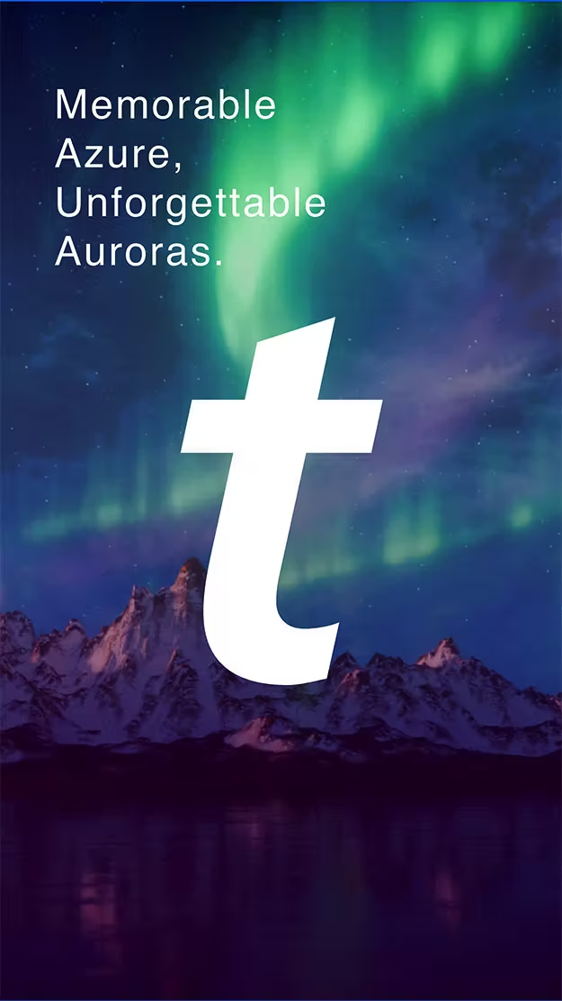
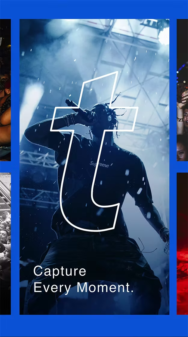
The transition from design to a fully functional splash page demanded precise coordination and attention to detail. This phase emphasized performance optimization, ensuring animations and transitions were lightweight yet impactful. Lottie animations were implemented for smooth, scalable motion, while After Effects was used for high-fidelity prototyping, allowing detailed previews before final development. Ensuring responsiveness across different screen sizes and devices was a key focus, refining interactive elements to function seamlessly across platforms.
Usability AND Accessibility //
Rigorous usability testing ensured seamless navigation and interaction across all devices. Accessibility refinements focused on contrast ratios, keyboard navigation, and screen reader compatibility, ensuring an inclusive experience while maintaining the energy of the brand.
Testing the final product for seamless navigation and interaction, refining details to enhance accessibility while maintaining the energy and excitement of the brand.

Desktop

FINAL-FINAL–Site—Aurora—TM—Homepage—1440—Desktop_01.jpg
FINAL-FINAL–Site—Aurora—TM—Homepage—1440—Desktop_02.jpg
FINAL-FINAL–Site—Aurora—TM—Homepage—1440—Desktop_03.jpg
FINAL-FINAL–Site—Aurora—TM—Homepage—1440—Desktop_04.jpg
FINAL-FINAL–Site—Aurora—TM—Homepage—1440—Desktop_05.jpg
FINAL-FINAL–Site—Aurora—TM—Homepage—1440—Desktop_06.jpg
FINAL-FINAL–Site—Aurora—TM—Homepage—1440—Desktop_07.jpg
FINAL-FINAL–Site—Aurora—TM—Homepage—1440—Desktop_08.jpg

Mobile

FINAL-FINAL–1 Site—Aurora—TM—Homepage—414—Mobile_01.jpg
FINAL-FINAL–Site—Aurora—TM—Homepage—414—Mobile_02.jpg
FINAL-FINAL–Site—Aurora—TM—Homepage—414—Mobile_03.jpg
FINAL-FINAL–Site—Aurora—TM—Homepage—414—Mobile_04.jpg
FINAL-FINAL–Site—Aurora—TM—Homepage—414—Mobile_05.jpg
FINAL-FINAL–Site—Aurora—TM—Homepage—414—Mobile_06.jpg
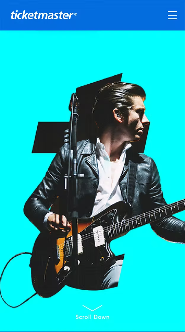
FINAL-FINAL–Site—Aurora—TM—Homepage—414—Mobile_07.jpg
FINAL-FINAL–Site—Aurora—TM—Homepage—414—Mobile_08.jpg

Transitional Prototyping

TRANSITION EXAMPLE #1

TRANSITION EXAMPLE #1

TRANSITION EXAMPLE #1

04

Digital
Signage

Just as the energy of live events is felt in every moment, signage needed to reflect that vibrancy. The challenge was ensuring digital and venue displays not only provided information but also contributed to the atmosphere, reinforcing the event's excitement. Displays were designed to stand out, making it clear where fans could buy tickets while seamlessly integrating into the live experience.

ASSIGNMENT //
Develop signage solutions that met the unique demands of sports and entertainment venues, ensuring visibility and engagement. This involved designing adaptable visuals that balanced branding and function while accommodating venue-specific needs, sponsorship placements, and audience flow considerations.
DELIVERABLES //
Dynamic digital signage, venue takeovers, wayfinding visuals, branded LED board animations, sponsorship integration, and promotional placements across stadium screens
Process //
The approach involved collaboration with venue partners to understand spatial opportunities, integrating motion design for engaging visuals, and aligning with marketing teams to ensure messaging was both informative and compelling. Real-time updates were incorporated to adapt messaging based on event flow and audience behavior.
Role //
Worked closely with design and motion teams to ensure visuals aligned with brand identity, contributed to messaging strategy to enhance engagement, remained flexible to feedback from venue stakeholders to refine designs, and adjusted creative elements to align with evolving on-site needs and stakeholder feedback in an ever-changing visual market where flexibility and strategic design were key to maintaining impact.

Key Challenges

Massive Scale

Executing campaigns at this scale demanded more than just systems—it required seamless collaboration between creative, technical, and operational teams. Balancing distinct priorities while ensuring consistency across platforms called for a dynamic, adaptable approach.

Unified Focus

Every campaign had to align with diverse priorities—from league guidelines to team branding—while adhering to Ticketmaster’s unified creative strategy. Navigating approvals across multiple stakeholders added layers of intricacy.

Quick Pivots

Shifts in schedules, venues, and sponsorships required a nimble creative workflow. Quick pivots to address real-time changes ensured campaigns stayed relevant without sacrificing quality or consistency.


Takeaway

Creativity at scale isn’t just about production—it’s about connecting every detail to a larger story. Working with Ticketmaster, we turned each campaign into a moment fans could feel, proving that even the smallest asset can carry the weight of a live experience.


Creative
Credits

CREATIVE DIRECTOR// Drew Manese
ART DIRECTOR// Angel Alfaro
ART DIRECTOR//  Leone Ermer
ART DIRECTOR// Brendan Cosgrove 

DESIGNER// Batu Aras
DESIGNER// Kevin Rask
DESIGNER// Mariah Phillips
DESIGNER// Paul FLores

MOTION// Drew Emery
MOTION// Paul Rabe
MOTION// Caroline Marks
MOTION// Eduardo Espinoza
COPYWRITER// Nate Sherman
COPYWRITER// Charlie Kindinger
COPYWRITER// Lauren Wierzbicki

STRATEGIST// Cristina Pedroza